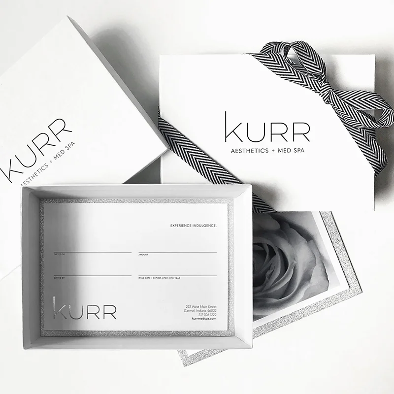
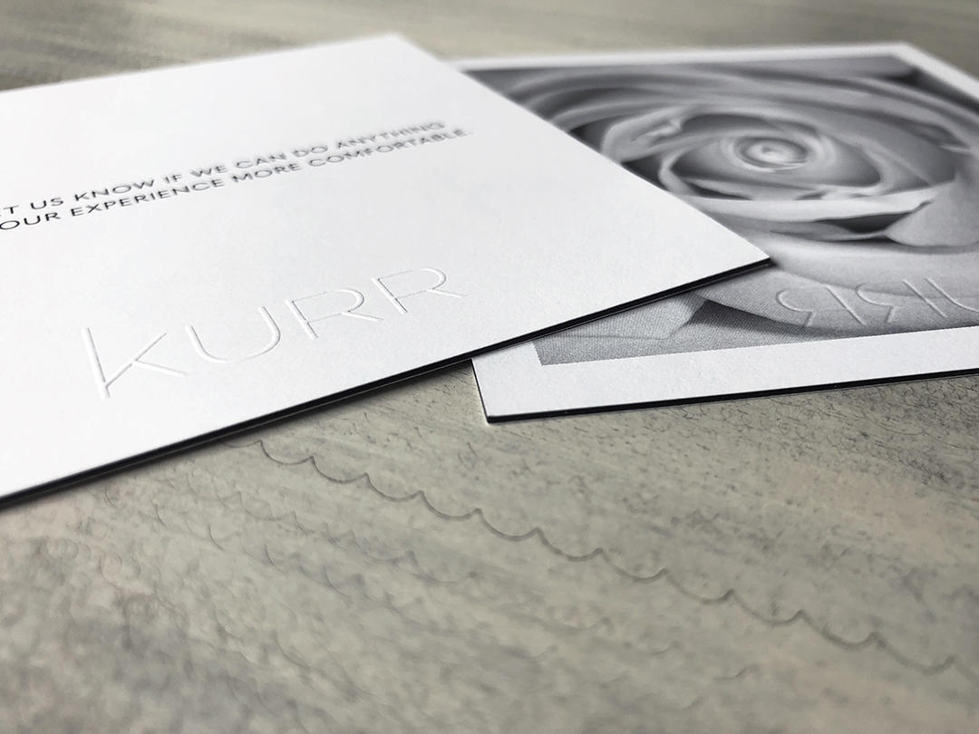
Fresh off the press are KURR Med Spa's gift card packaging and welcome cards, featuring a silver foil stamp and blind emboss.
sticky stuff
As part of its branded materials, H. Josephine Home requested tape for sealing tissue-wrapped goods and gift boxes. I located a vendor in New York who specializes in custom-printed washi, masking and other sticky materials. The tape lends such a fun and unexpected detail to the boutique's packaging.
getting crafty
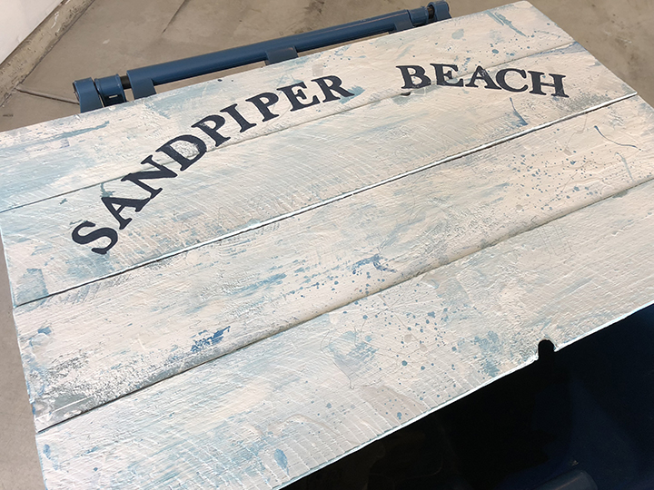
I was charged with crafting custom art for an eight-year-old's bedroom makeover in which the little girl asked for the theme to be "beachy and include sandpipers" (she became fascinated with the shorebirds while vacationing in Cayman with her family). I started by creating a digital rendering of the design as my blueprint…
…and the process continued, beginning with the raw boards (recycled from an old wooden fence), to hand painting, and eventually "weathering" of the sign to lend an authentic feel.
website launch: mynettrainer
MyNetTrainer is an online fitness program that delivers workout videos to paid subscribers, allowing them to exercise in the comfort of their surroundings and whenever it is convenient for them. To accomplish such a subscription-based service, I created MyNetTrainer's website and then integrated a third-party membership platform and payment gateway. See more at MyNetTrainer.com.
marketing tools
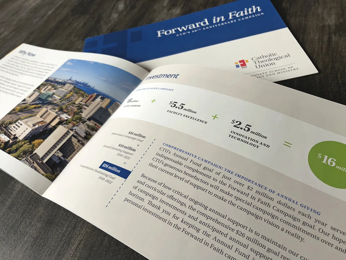
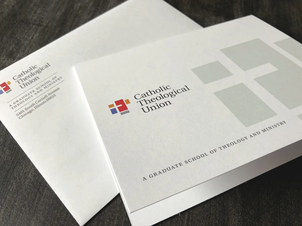
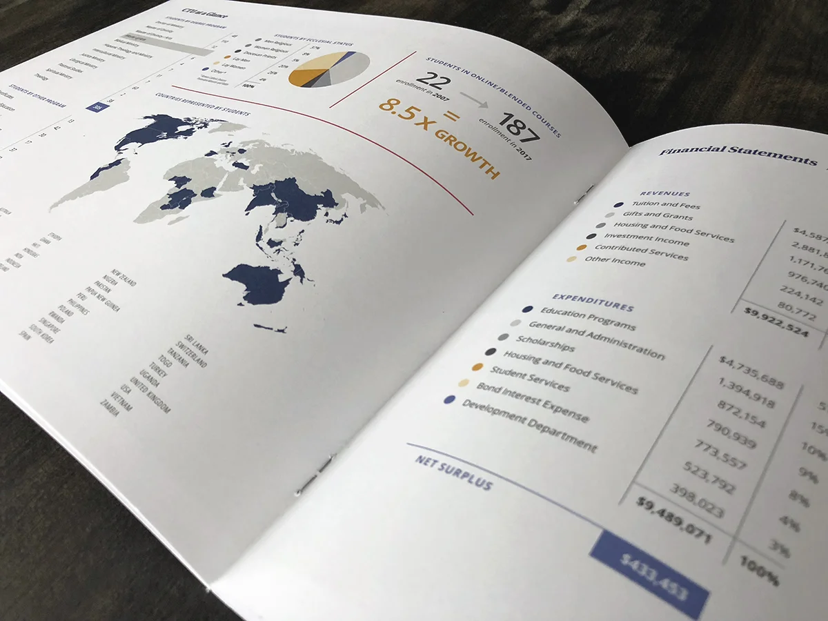
I recently wrapped a variety of pieces for Catholic Theological Union's marketing toolkit. Sampled below are CTU's at-a-glance brochure, a giving appeal booklet, one of several stationery components, and an event poster.
website launch: h. josephine home
For H. Josephine Home, I created a single-page, fluid website focusing on photographs of the shop's space and product offerings, complemented by only essential business information. The site features a special visual effect on select header images called parallax scrolling — a function that involves a background image moving slower than the content in the foreground, creating an illusion of depth and immersion. Take a peek at hjosephinehome.com, where you'll see the following screenshots of the general concept come to life...
fresh from press
In celebrating its 50th anniversary this year, Catholic Theological Union strengthened its commitment to its vibrant history and mission by refreshing its visual identity. CTU's new brand development was synchronized to rollout with its first communications piece of 2018, its 2016/17 annual report.
website launch: hewitt law & mediation
As Hewitt Law & Mediation plans to announce its official launch in January 2018, we've completed the firm's website and it is now live. Congratulations are also in order to partner Brian Hewitt for being named to Indiana Super Lawyers for his tenth year in a row!
inspired
Design is my pure joy. So the creative license I had today in photographing H. Josephine Home — a one-of-a-kind home interior boutique in Broad Ripple — was a treat. I was capturing images for placement on the shop's website, our next project. I initially worked with owner Mandy Skelton to create the H. Josephine Home logo, which can be seen on the artisan match boxes we ordered as well as the storefront window. Watch for this gem to open January 2018.
hewitt law & mediation
Brian Hewitt's new law and mediation firm, opening in early 2018, was in need of an identity which communicated ideas of bridging, reconciliation and harmony, as well as a stationery system. The design complements the firm's new industrial office space built in the framework of a historic firehouse on the corner of Alabama and New York in Indianapolis. And the project continues — we're currently working on additional corporate materials, including a firm profile packet, advertisement and website.
the reinvention
I was tasked with redesigning an existing publication for Jesuit Volunteer Corps — its bi-annual periodical named JVC Magazine. The magazine now reflects the organization's grit and doing-daring-caring nature.
The reinvented magazine…
The old magazine…
ten ads, one happy client
In developing a new advertisement series for placement in Indiana Lawyer magazine, Wilson Kehoe Winingham — a personal injury law firm — wished to promote attorney referrals while focusing on its key practice areas. We created ten full-page ads ranging from aviation accidents to medical malpractice to more unique cases like a zipline failure and airbag malfunction.
a new newsletter
Catholic Theological Union (CTU), a graduate school of theology and ministry in the heart of Chicago, wanted to breathe new life into its biannual publication, Logos. While the spirit of its oversized format was sustained, the dimensions were modified to be more human-friendly, and a non-reflective matte paper stock replaced its one-time, hard-to-read gloss finish. The self-mailing piece was also redesigned to ship as a flat, eliminating an unwieldy puckering issue of the former newsletter.
The publication's layout, as well as its styles and aesthetics, received a complete transformation — one that will welcome and delight eyes when it arrives in mailboxes nationwide this spring.
website launch: chris bucher photographs
When your photography does all the talking, who needs words? Such is the case with accomplished photographer Chris Bucher, where his new website's simple menu and linear style allows his art to shine. See the people, places and things he's captured at chrisbucher.com.
pre-spring cleaning
The Independence Academy provides education for middle school and high school students with high-functioning autism and Asperger syndrome. IA reached out to me for help with examining their image, and unifying it across all of their marketing materials. I started by buttoning up their existing logo and revamping their online presence. The school's former website lacked both user-friendliness and sophistication. Before and after screenshots are below.
I also developed and/or redesigned a variety of collateral, including an informational brochure, SGO brochure, admissions form, scholarship form, presentation folder and prospective parent documents, as well as an invitation set and sponsorship packet for the school's annual March Forth for Autism gala.
Shout out to Chris Bucher Photographs for lending incredible talent for our photo shoot, and so beautifully capturing the spirit and culture of The Independence Academy!
a legit book
When Wilson Kehoe Winingham's marketing director contacted me about creating a coffee table book to showcase the firm's advertising strategies, I researched and recommended that we use blurb.com as our short-run publisher. After all the planning, photography and design time, the much-anticipated deliverables arrived today, and I couldn't be happier with the insanely high production quality.
oh christmas tree, oh christmas tree
The Oaks Academy is holding their first-ever Christmas Tree Festival this month, a fundraiser sure to kickoff a joyful holiday season. Assignments for the event included a save the date postcard, a Preview Night invitation, posters, admission tickets, a program, and much more. Learn more at theoaksacademy.org/christmas.
making a splash at the trade show
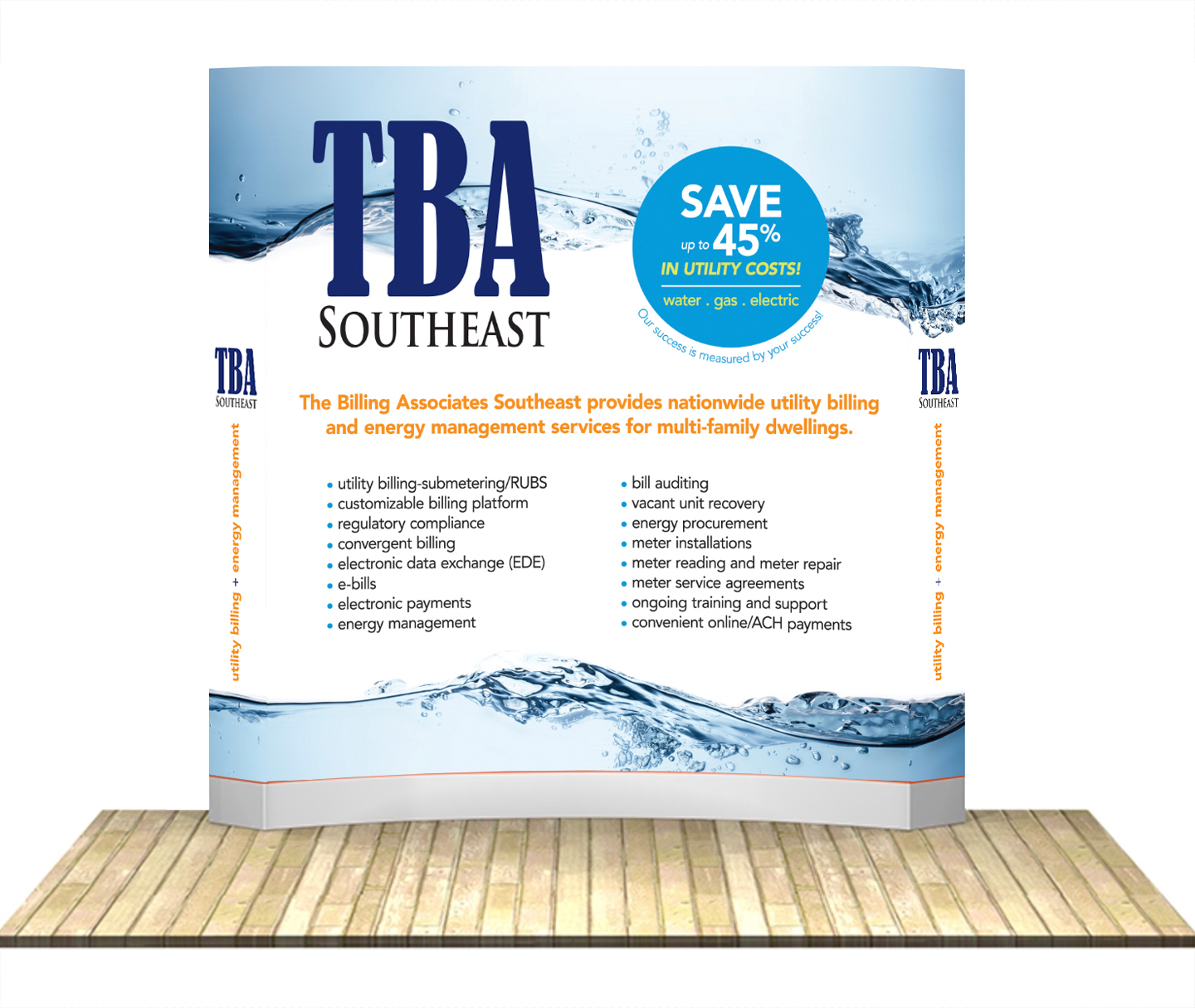
The Billing Associates Southeast provides utility and energy management services to multi-family dwellings (condominiums, apartment complexes, etc.) across the nation. For a trade show it's participating in this fall, the company chose an eight-foot, curved display from an exhibit supplier. My job? To make the large, blank canvas both informative and attractive. Ta-da, here's the final design (shown as flat artwork and a superimposed rendition)…
website launch: choosing home
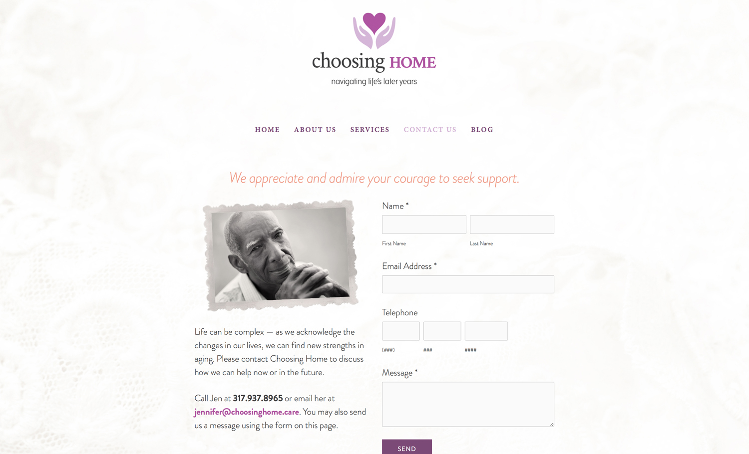
Choosing Home provides high-quality, holistic care to older Hoosiers, and helps with alternative arrangements when remaining in the home is no longer appropriate.
So when the owner consulted me about developing Choosing Home's corporate identity and website, I recognized the job would require me to design these assets through a soft, gentle lens. Jen is now busy serving families and acquiring new clients with her fresh-off-the-press branding, tender heart, and mastery of nursing and social work.
Learn more about Choosing Home's personalized services at choosinghome.care.
a refresh
As I was working with Orthopaedic Partner, based in Tampa, Florida, on a job involving the company's primary trade show display, they expressed dislike for their logo and felt it needed to be refreshed. So we temporarily halted the trade show project and focused attention to logo development. First thing's first, right? Orthopaedic Partner enthusiastically selected the new design I created, which represents the company in a more stylized, engaging manner.

