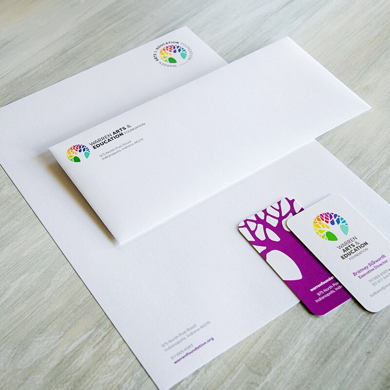
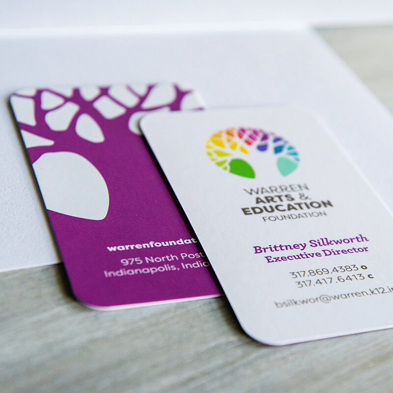
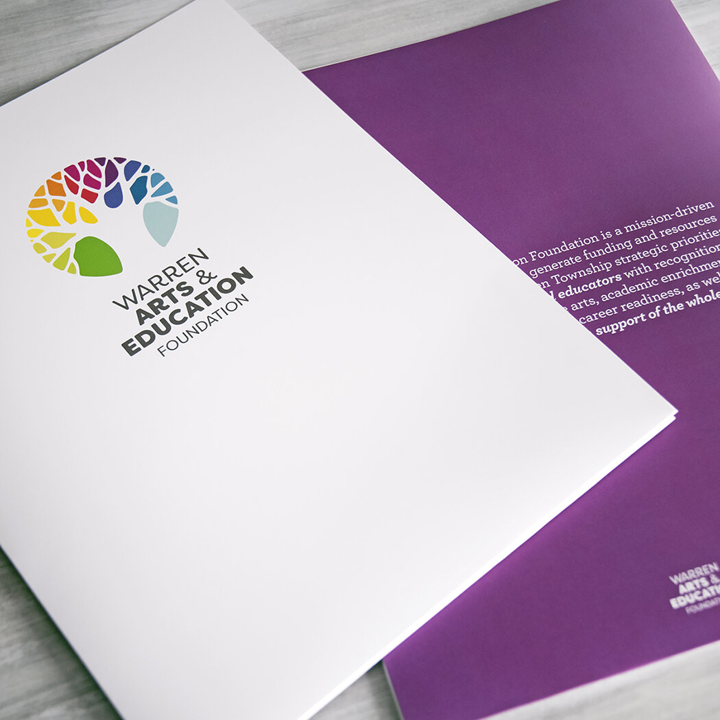
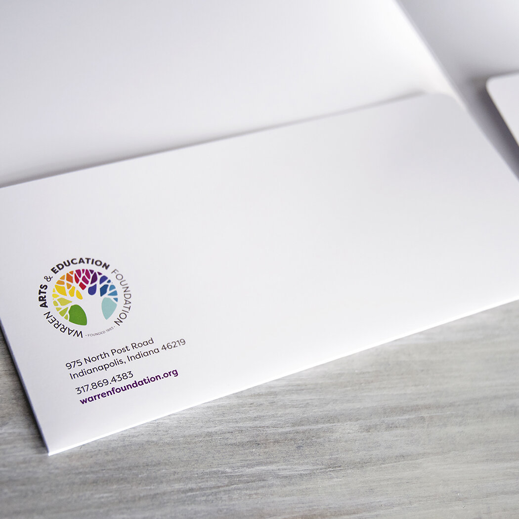
A shipment arrived this week of the Warren Arts & Education Foundation’s new stationery suite: letterhead, envelopes, business cards and presentation folders. A vibrant amethyst is used throughout the brand as a featured element, which will also be applied to an informational brochure and website now in the works.
stationery
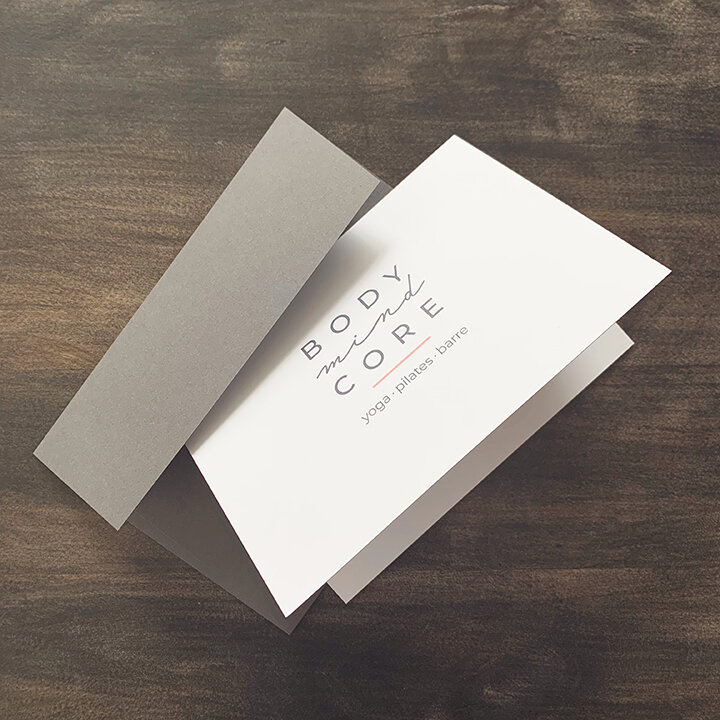
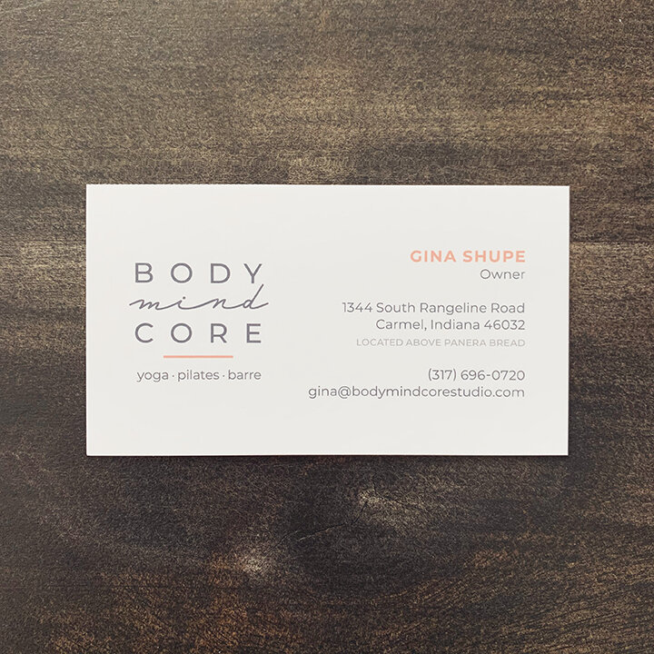
A few stationery items now finished on press for Body Mind Core…
photoshoot
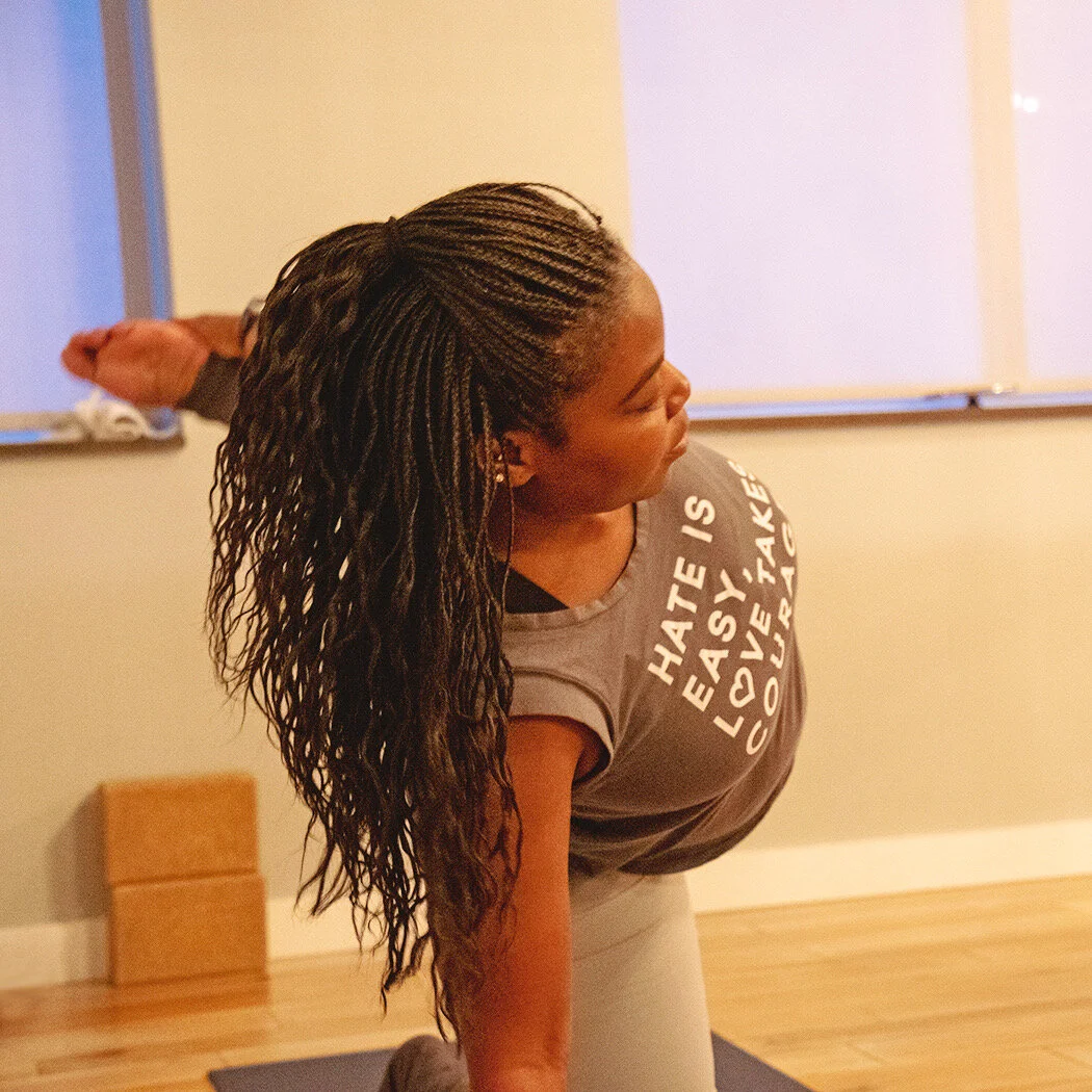
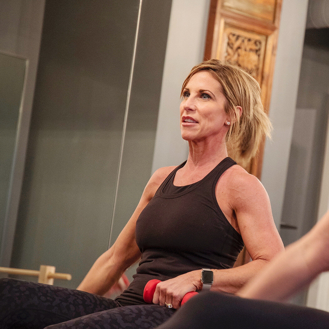
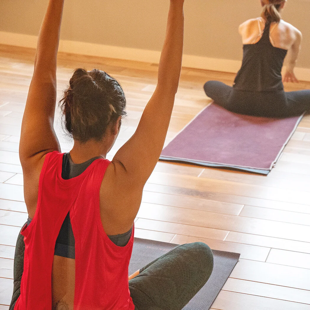
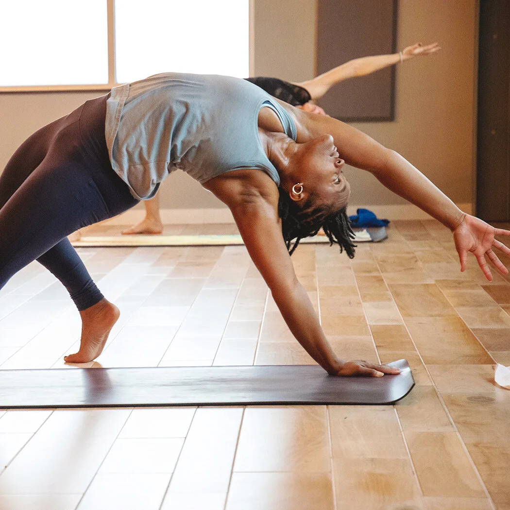
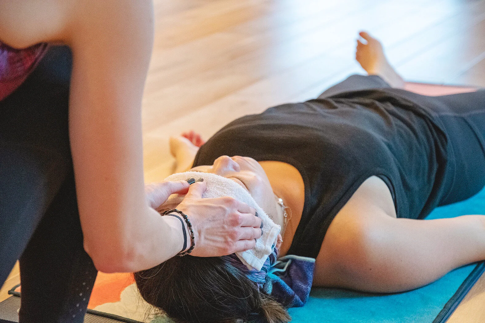
I had the privilege of photographing the strong, beautiful clients of Body Mind Core in February in preparation of beginning the studio’s new website…
a new identity
Through conversation and recalling personal experiences, BioAlignment’s team works with clients to facilitate memory reconsolidation, which is the process of modifying one’s longterm memory, thus enabling a client to shift his or her undesirable automatic responses and behaviors. For example, those who suffer from anxiety, emotional or psychological trauma, alcohol or nicotine dependence, depression, allergies, arthritis, asthma or physical pain, can benefit from memory reconsolidation therapy.
I began working with Tom DeLano, BioAlignment’s founder, at the start of the year to rebrand his Chicago-based company. The logo assignment is now complete, and I will soon advance to building the company’s new website. Below is BioAlignment’s former identity (how it appeared when Tom approached me with the job), followed by its new identity.
the old logo
the new logo
a new identity
I began working with the new owner of a thriving yoga, pilates and barre studio in Carmel earlier this month. Her goal was to maintain the name, but rebrand the business. The identity refresh is now complete, with gray and coral as the primary hues, and a complementary palette to accent. This coming week I’ll be at the studio to photograph a variety of classes. These images will primarily be used on the soon-to-launch Body Mind Core website, which is the next assignment I’ll be starting.
annual report
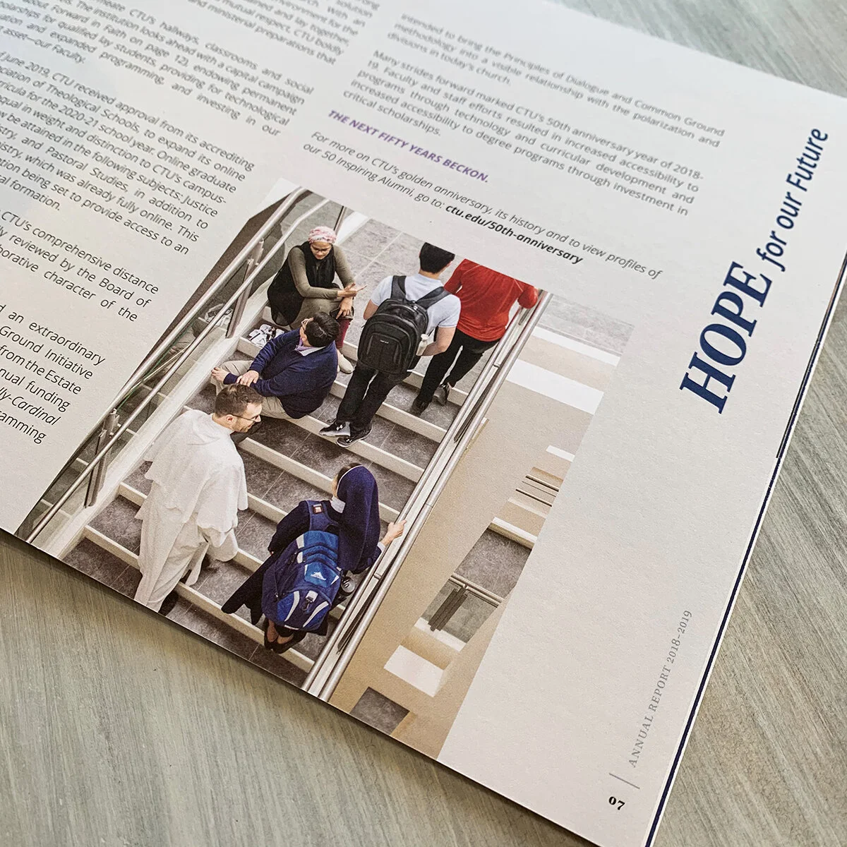
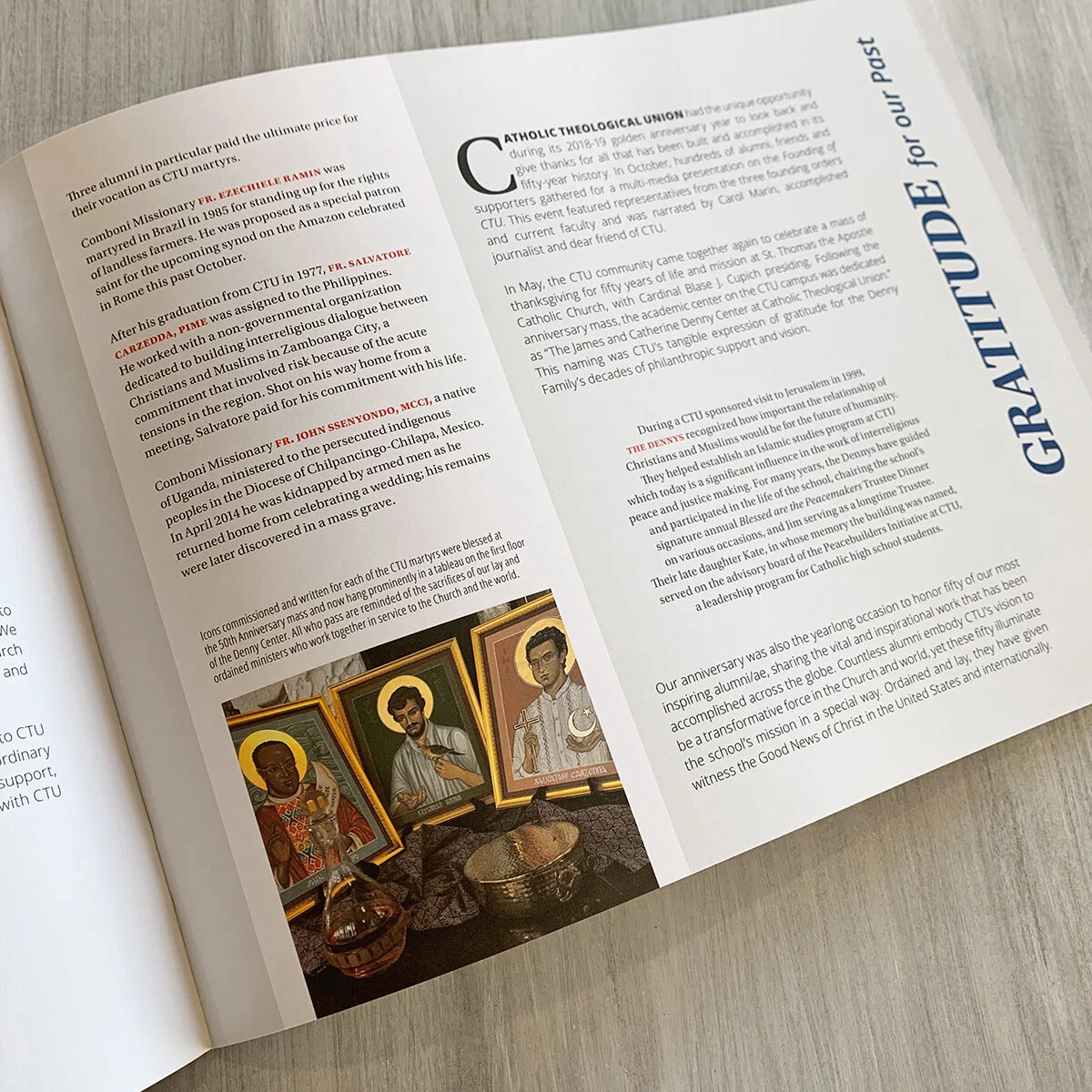
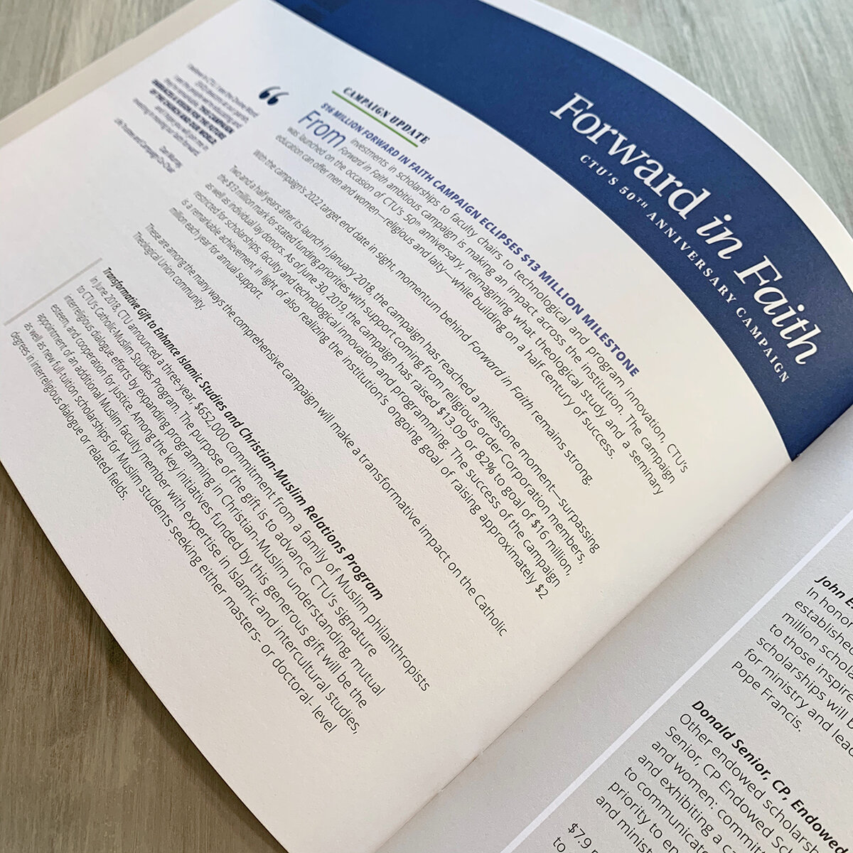
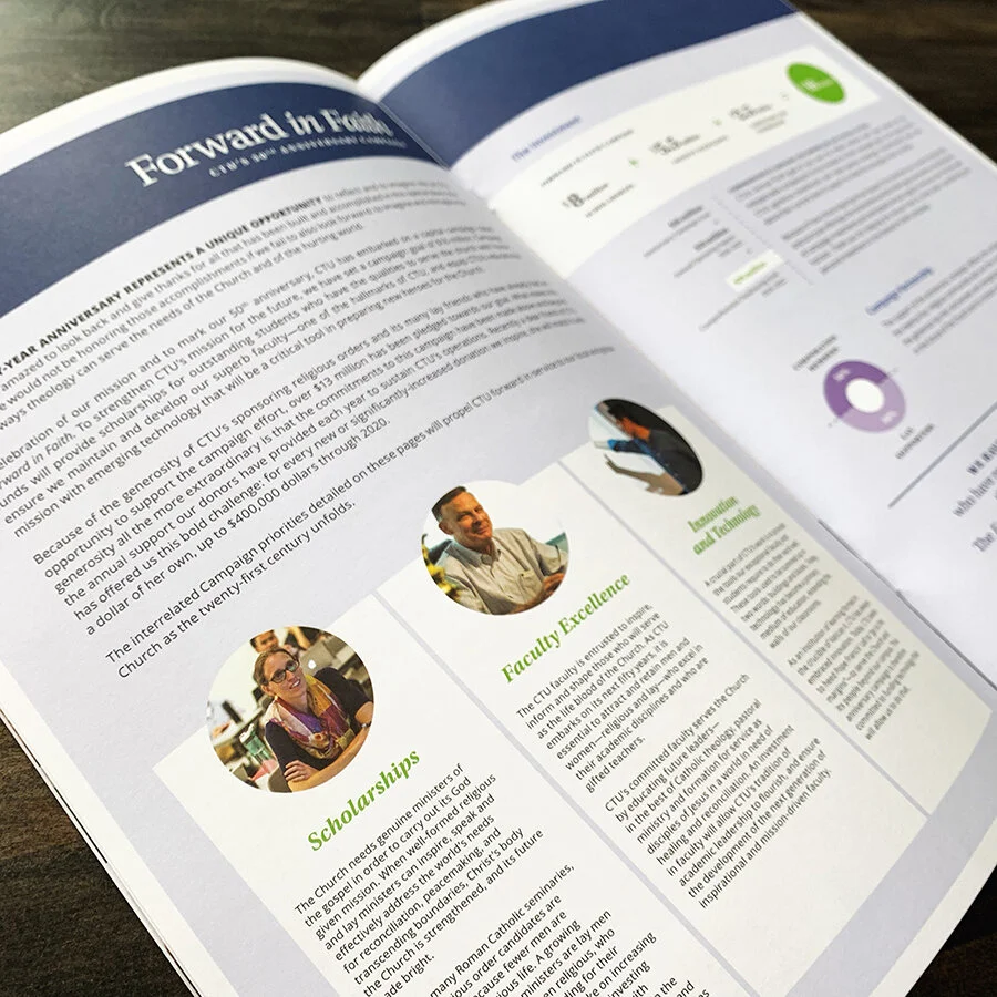
It’s fresh off the press and en route to mailboxes in the Chicagoland area — Catholic Theological Union’s fiscal year 2018/19 annual report.
photoshoot
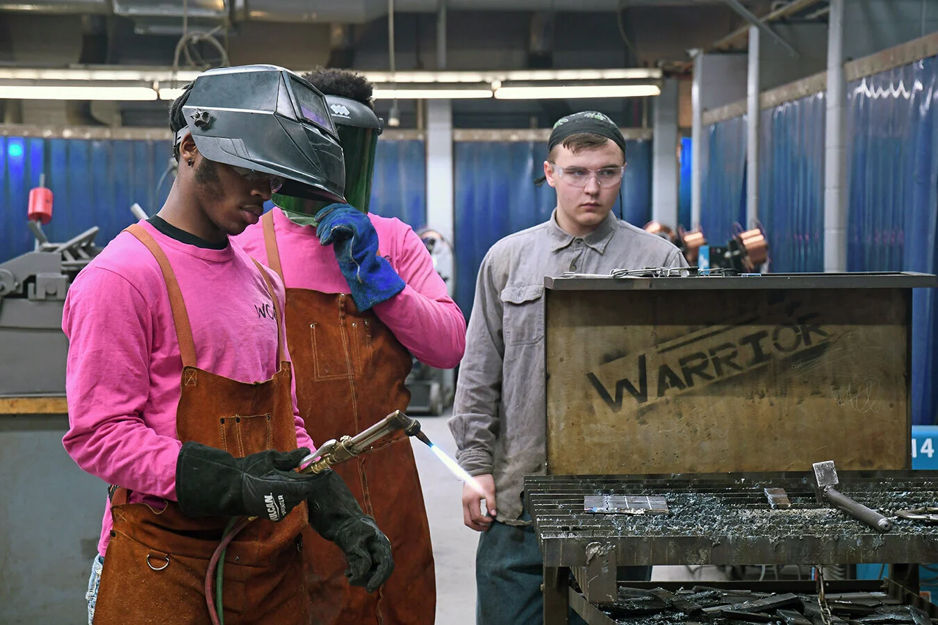
I recently was awarded a multi-tier job by the Warren Arts and Education Foundation. The organization is 37 years old and still uses one of its original identities. So we kicked off the job by exploring new logo concepts, fonts and color palettes, and will soon migrate into developing a stationery system, a redesigned website, solicitation/support collateral and more. But just yesterday, I visited five different school locations within the district to capture photography for use in the aforementioned assignments.
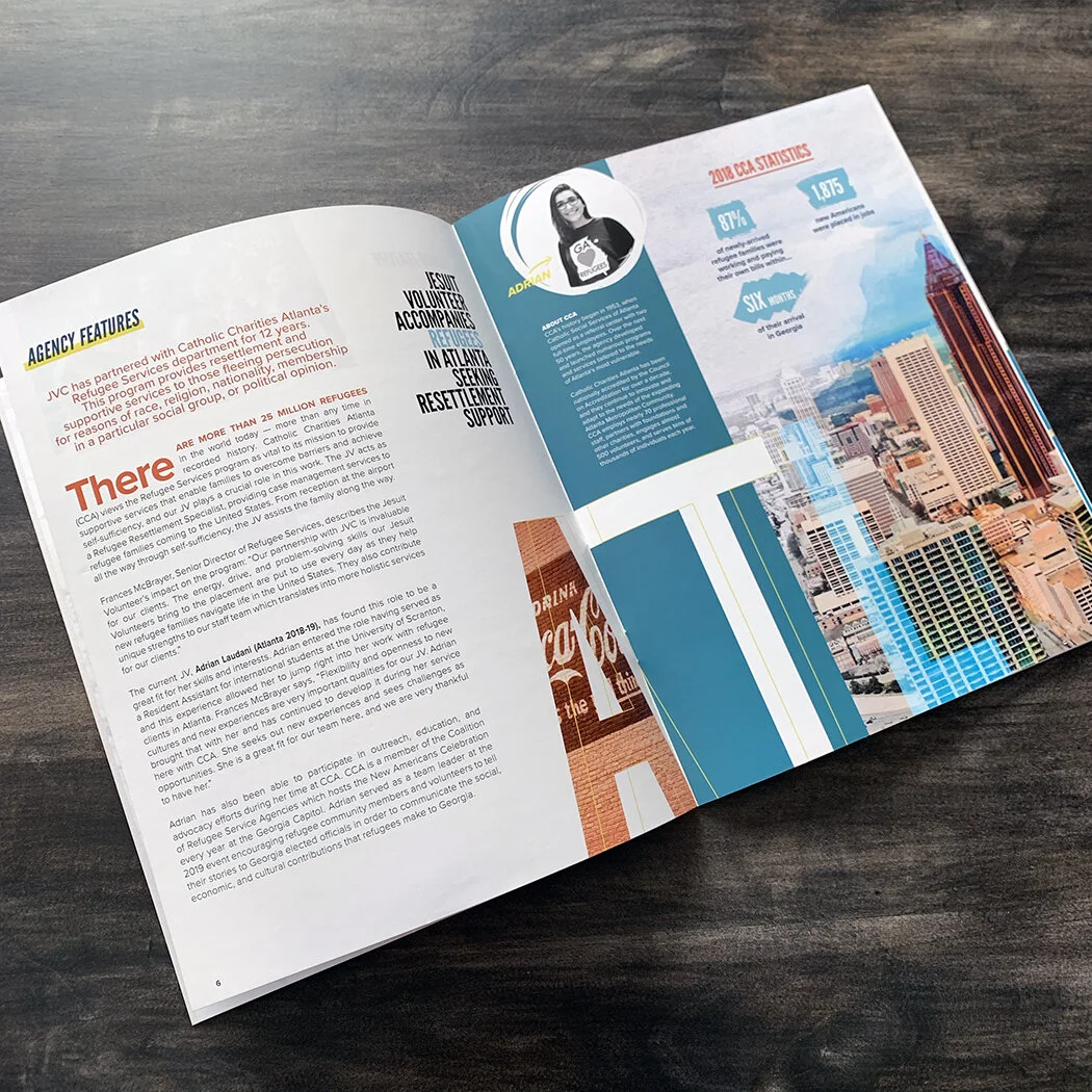
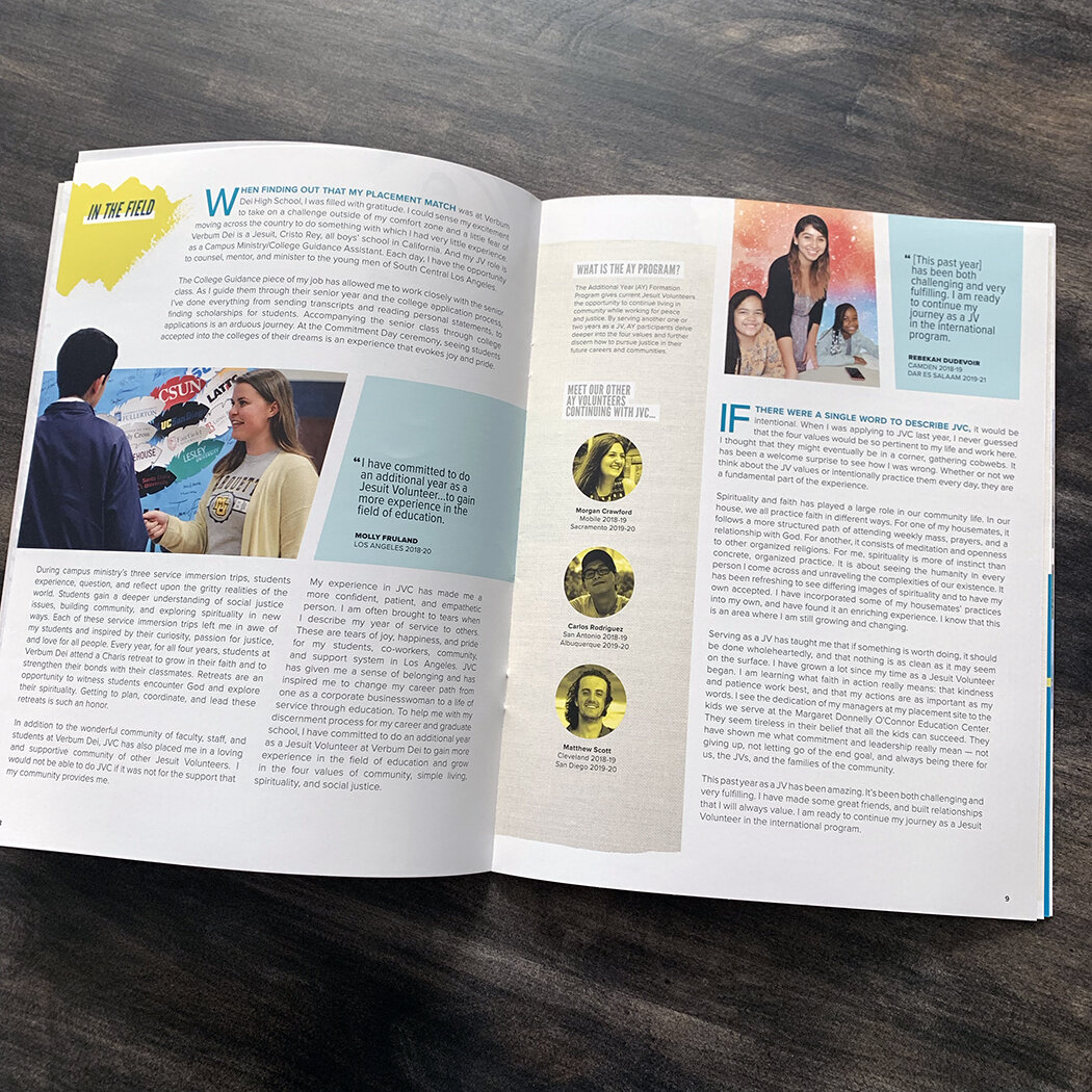
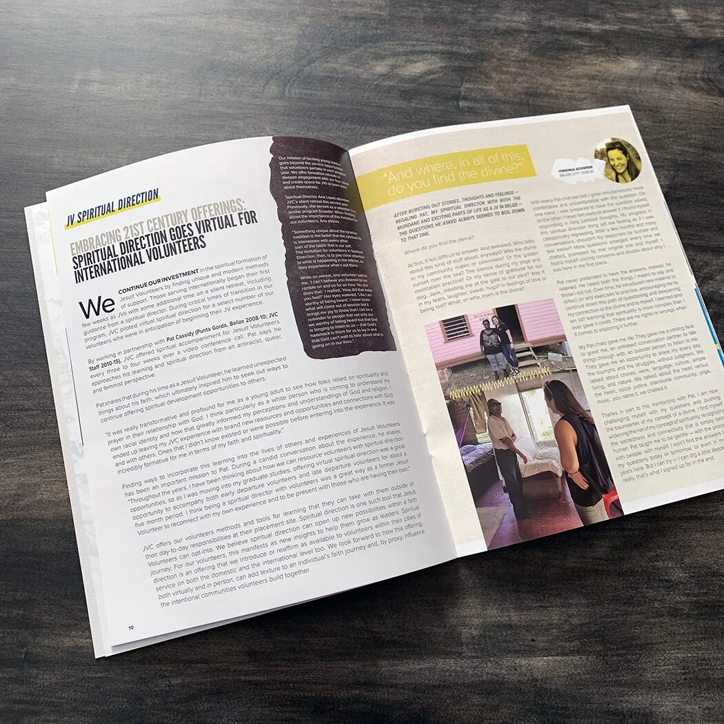
JVC Magazine
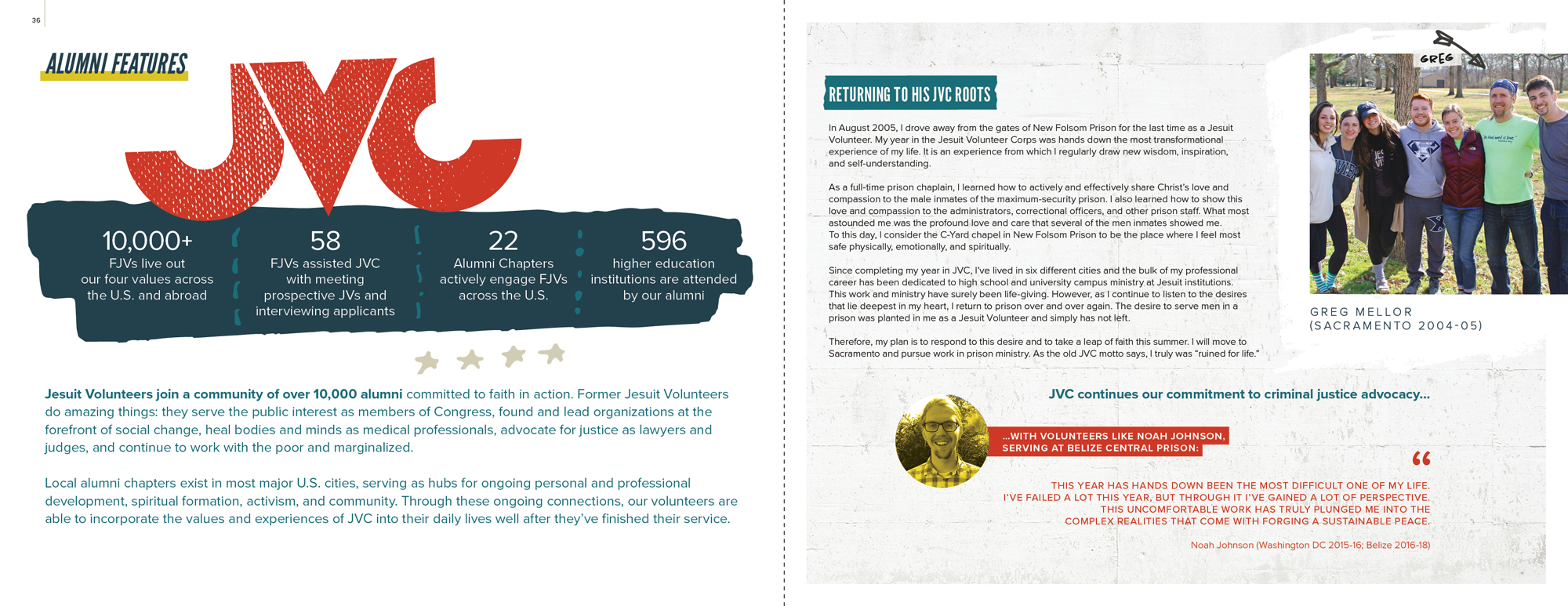
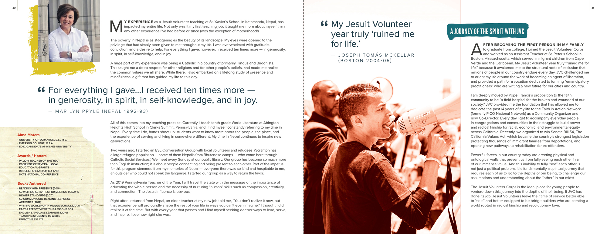
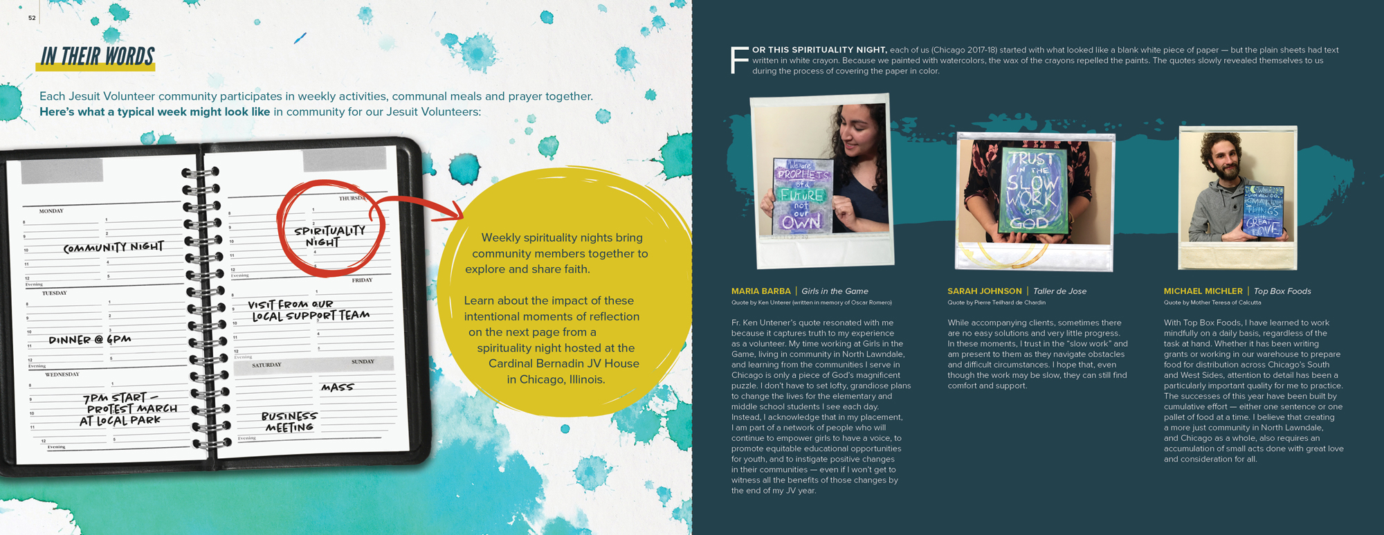
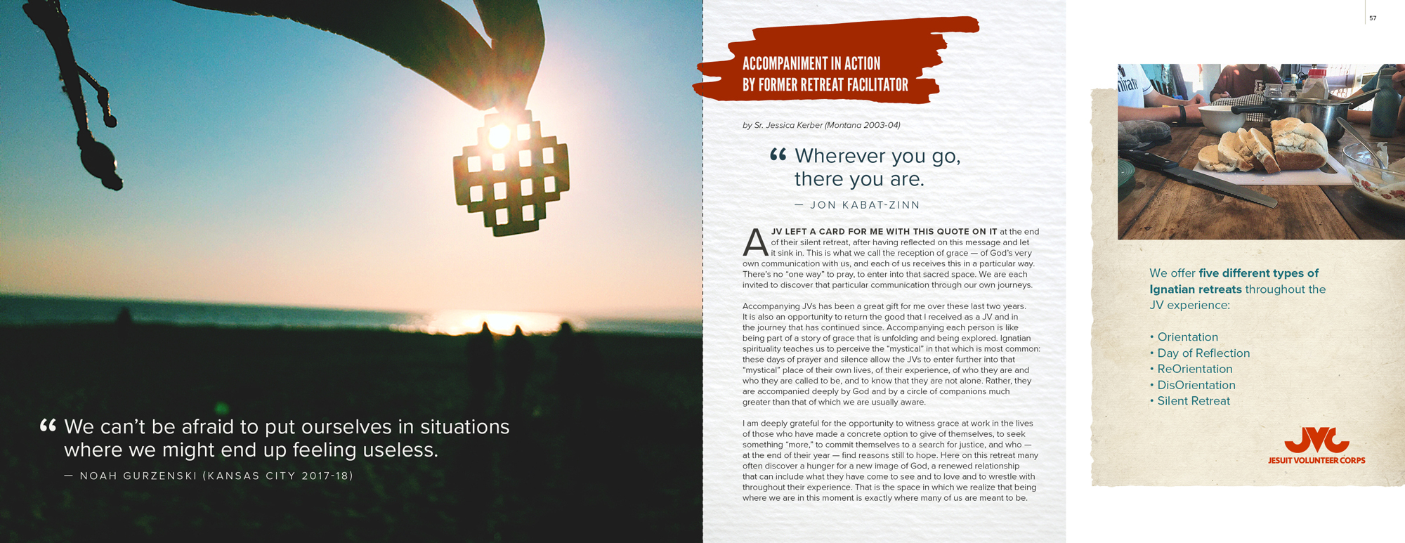
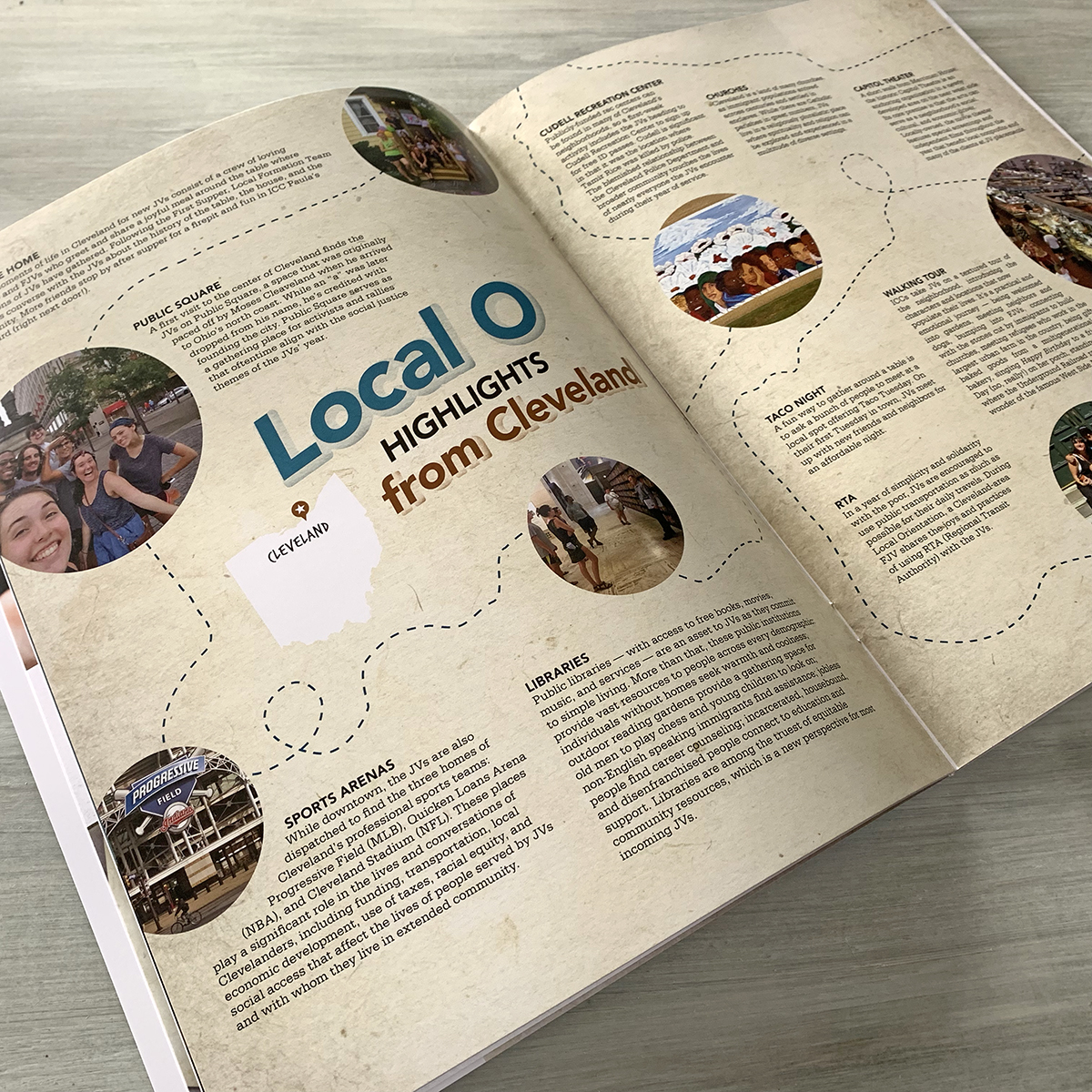
The 2019 edition of JVC Magazine will be arriving in mailboxes across the nation this week.
informational brochure
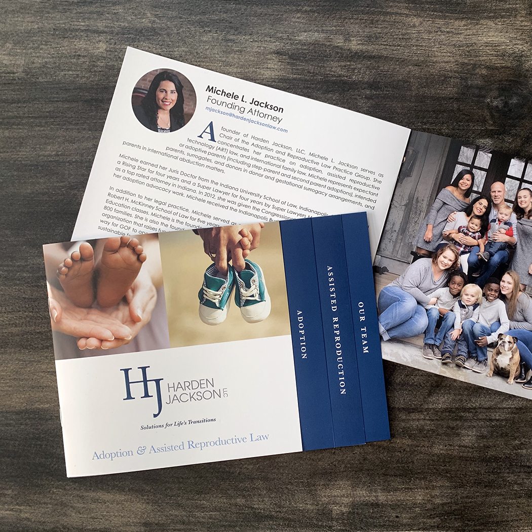
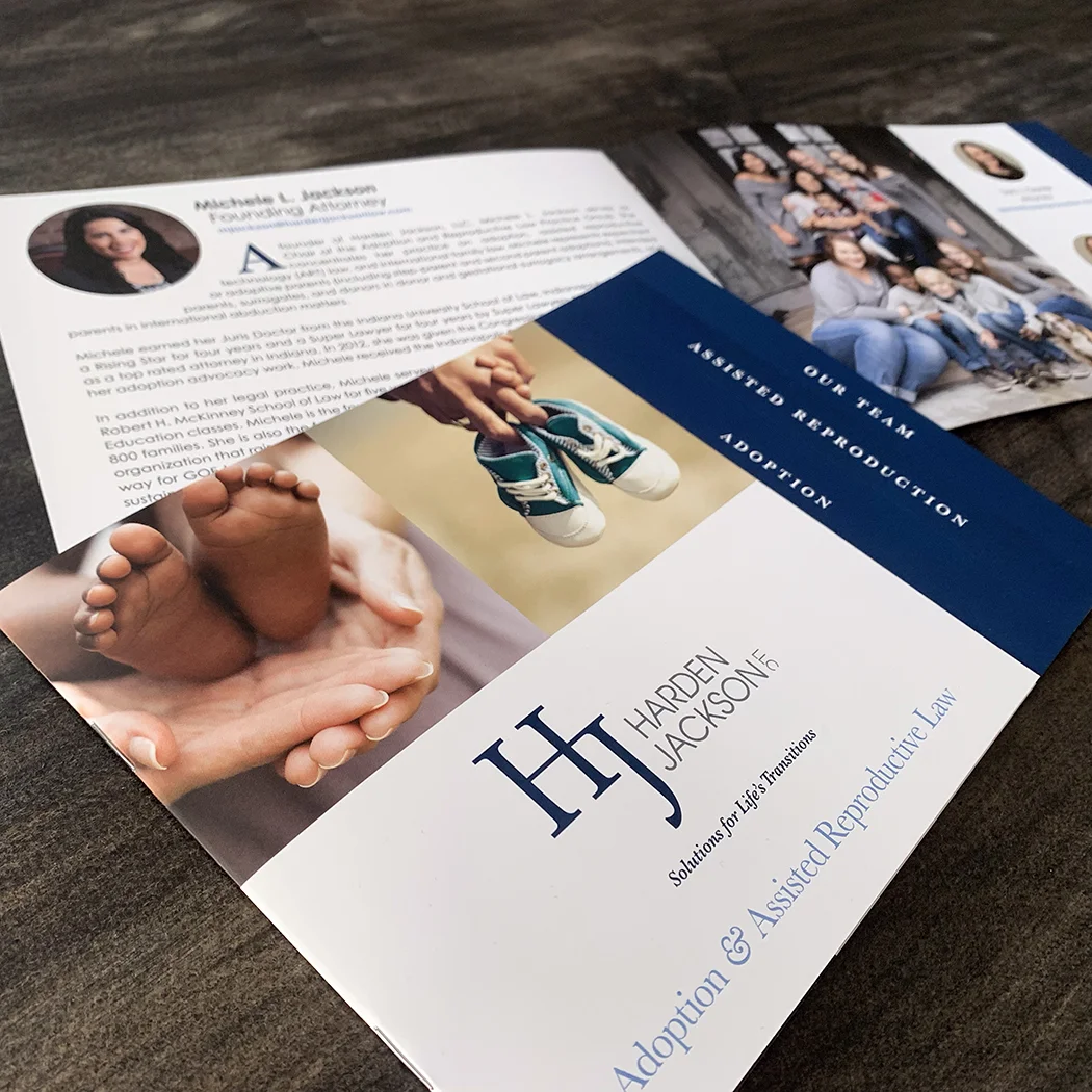
Harden Jackson is an all-female law firm in Carmel that practices several areas of family law. The firm’s adoption and reproductive law group is traveling this month to a conference in Texas for which they needed a takeaway brochure, retractable banner and beverage tags, among other items. Pictured here, with its stepped or tabbed design, is the informational brochure.
fresh off the press
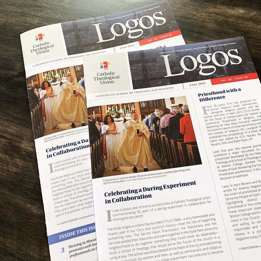
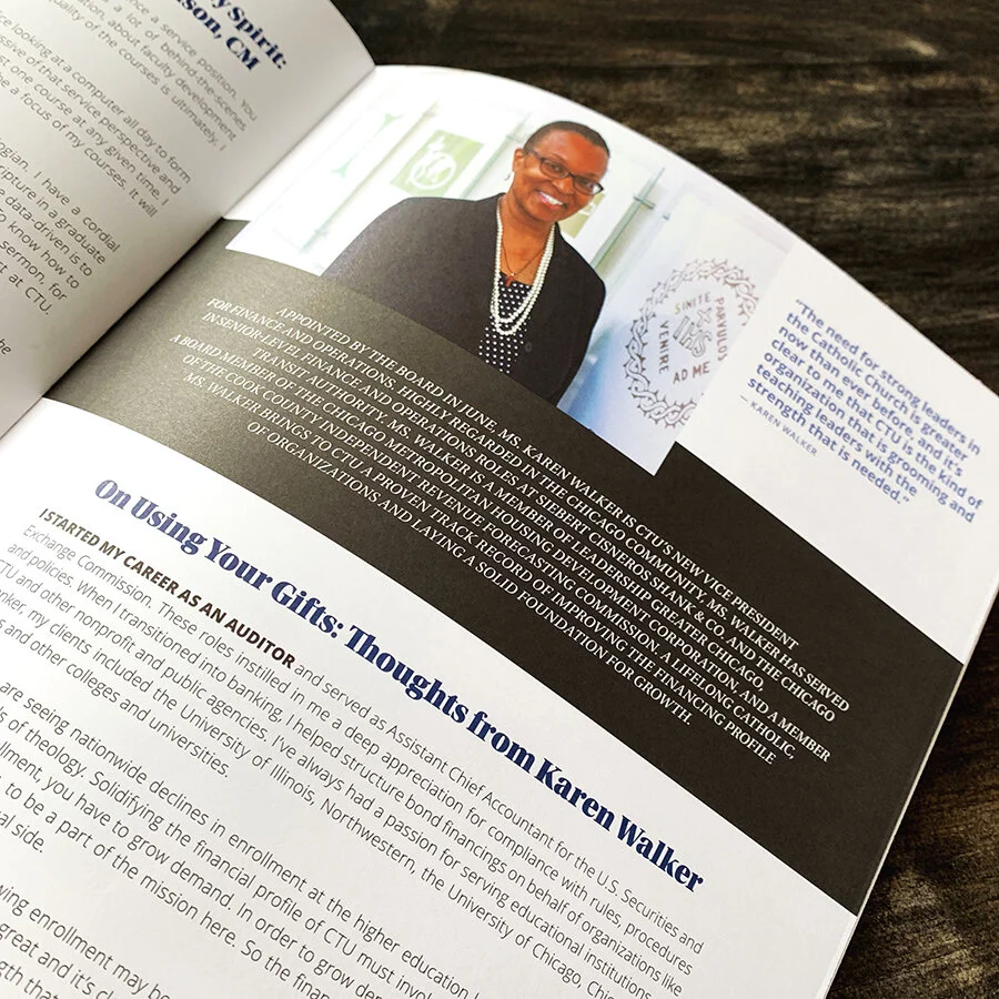
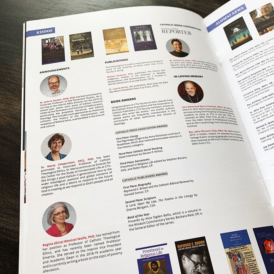
Catholic Theological Union’s fall edition of Logos, the organization’s bi-annual newsletter, has finished in bindery and is now en route to over 6,000 subscribers in the Chicagoland area. This issue was our largest yet content-wise at 24 pages plus a special two-panel foldout to honor alumni.
swag
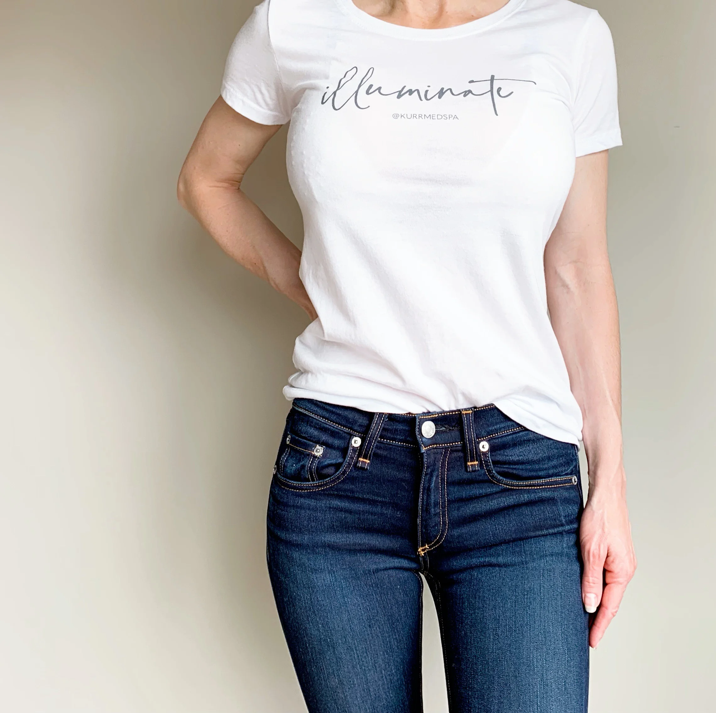
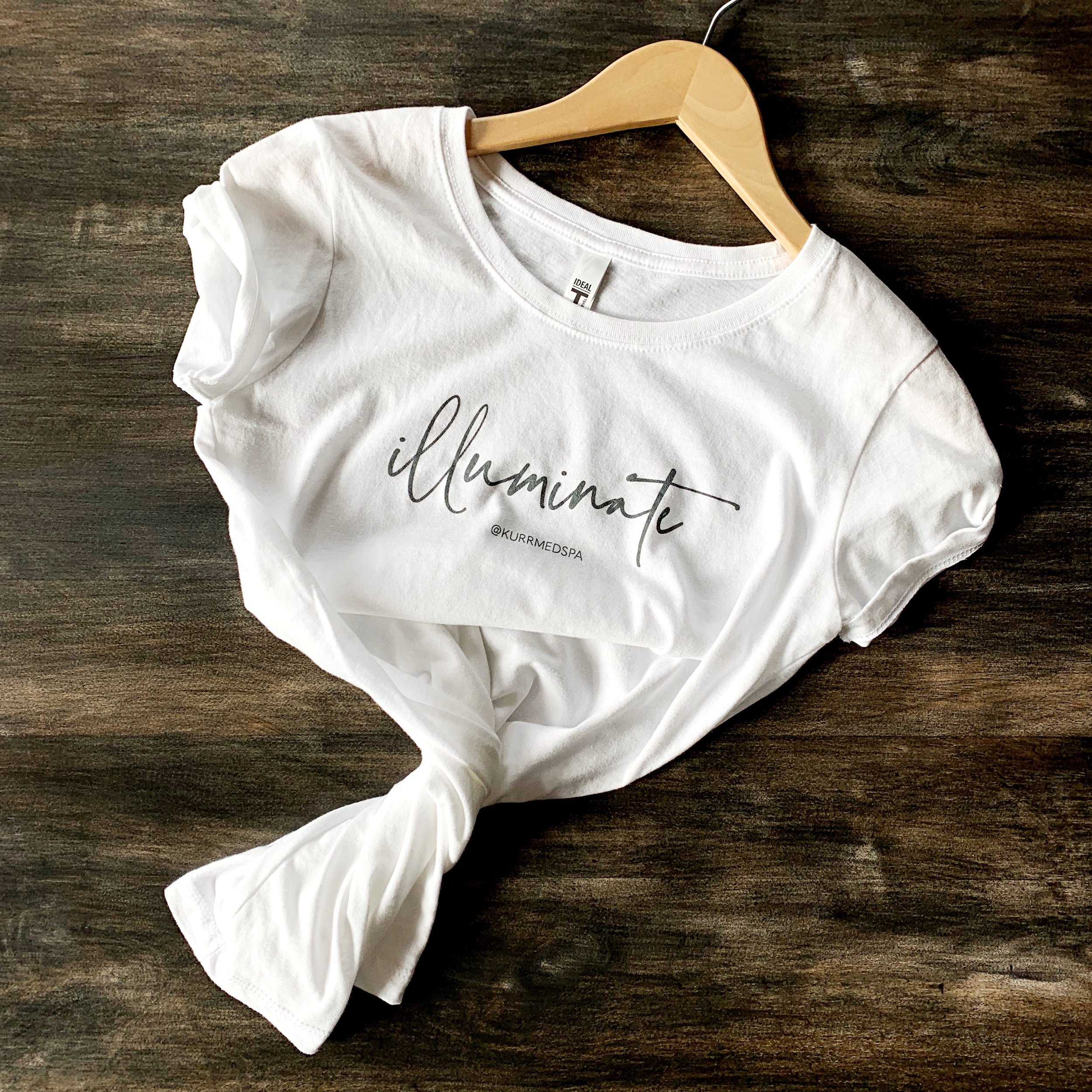
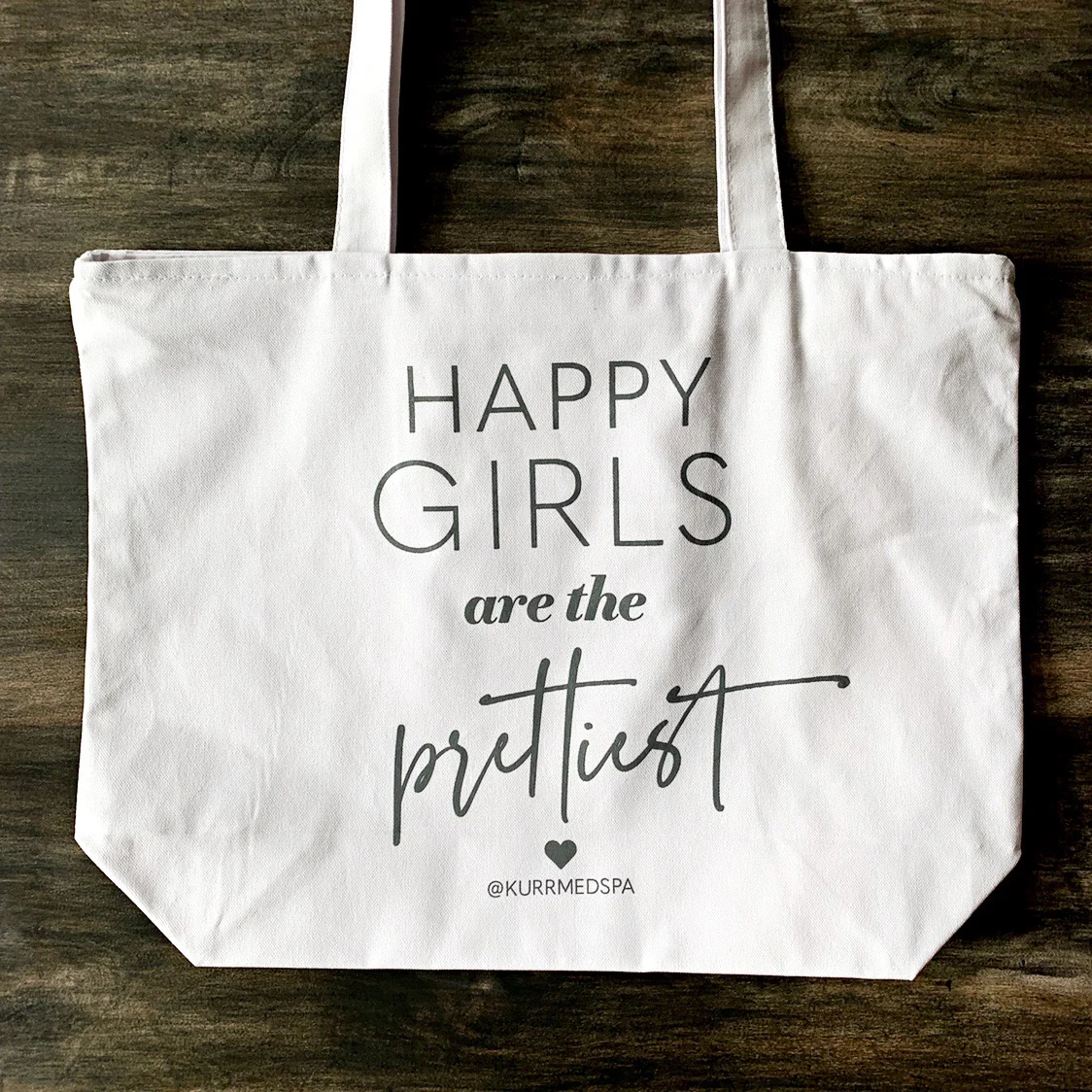
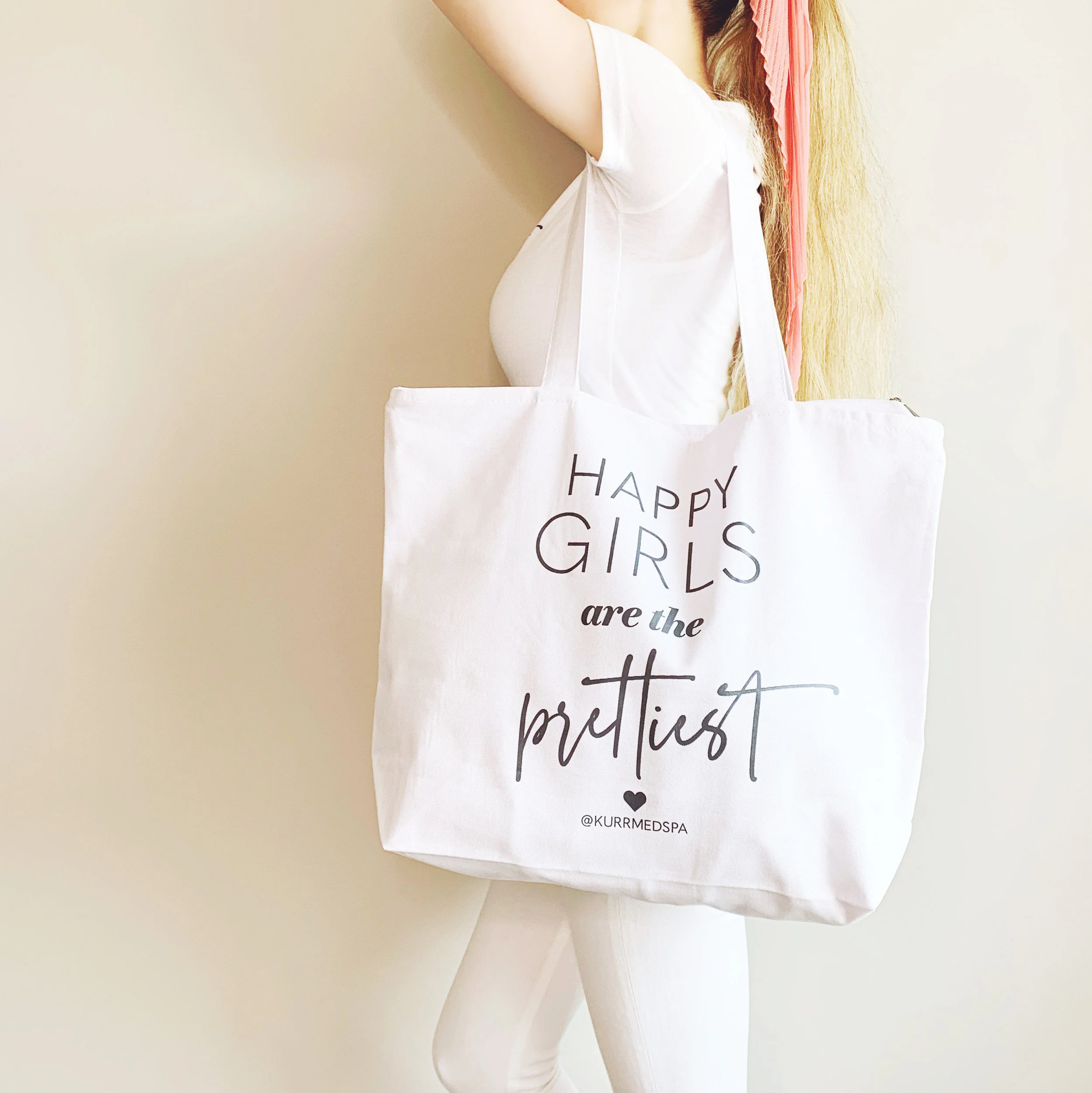
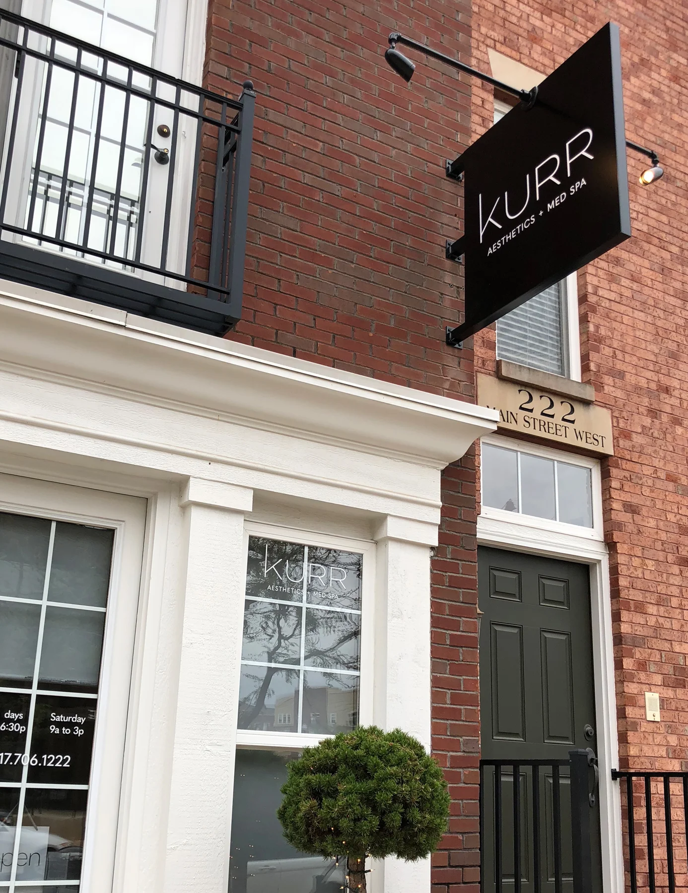
I created some promotional swag for giveaways as part of KURR Med Spa’s new client loyalty program. The concept was to go more of a fashion route than emphasizing the spa’s logo, yet include their all-important Instagram handle. Content development and design behind KURR’s Instagram account, by the way, is solely done by yours truly — I’m having so much fun applying my creativity through this interactive, engaging medium.
a sneak peek
We’re gearing up for production of the Jesuit Volunteer Corps’ Fall 2019 issue of JVC Magazine. This is the third annual issue I’ve been responsible for creating, but it’s the first to integrate the organization’s refreshed branding elements. A lot of creative energy has been placed into this piece — more to share once final edits are made, we go to press, and the deliverables are in hand.
changing names
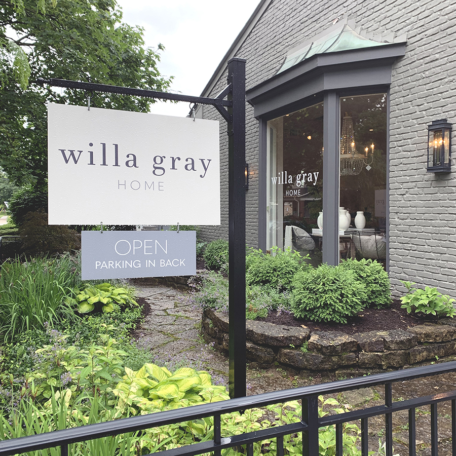
My client, H. Josephine Home — a luxury home boutique in Broad Ripple — continued to write their story by recently changing to a new shop name. Now known as Willa Gray Home, it’s prompted us to create all new signage and store goodies. First up was the window decals and yard sign, and now we’re focusing on updating business cards, thank you cards, retail shopping bags, fabric swatch tags, hang tags and a list of other items.
the white river vision plan
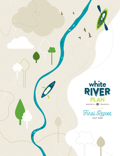
Since Spring 2018, I’ve been involved in a large-scale project named the White River Vision Plan that has enlisted the expertise of both local and national firms.
About the Project
The White River Vision Plan is a joint effort between the City of Indianapolis and Hamilton County Tourism, Inc. in partnership with Visit Indy’s philanthropic arm, Tourism Tomorrow, Inc. to develop a comprehensive and coordinated regional plan to enhance 58 miles of the White River in Marion and Hamilton counties. The goal of the plan is to create an accessible, recreational and cultural environment that encourages a unique sense of place for the community as a whole.
The Experts
Agency Landscape + Planning, a group of landscape architects, planners and urban designers, has been leading the group of local and national businesses. Agency’s team of local partners includes Christopher Burke Engineering, Engaging Solutions, RATIO Architects, Landstory, Pure Design and more. National team members include Land Collective and Heritage Strategies, among others.
My Role
I launched the project by developing its identity and related branding — the concept of the plan’s color palette, typography, styles and overall aesthetic. As the project continued, I embarked on such assignments as developing presentation slides, an executive summary poster, large-format exhibit boards, and a comprehensive report book.
an 88-pager
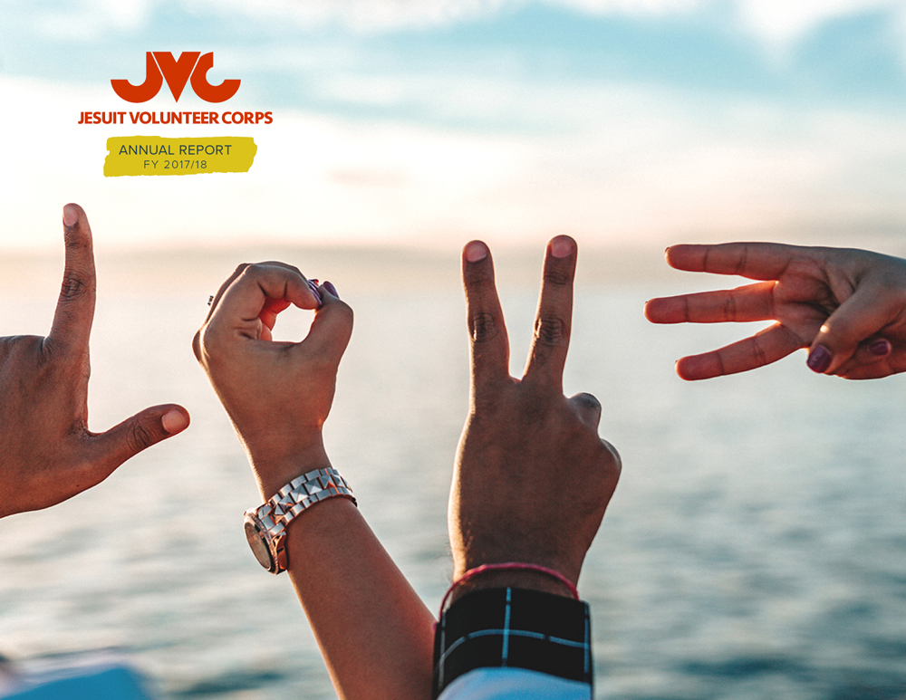
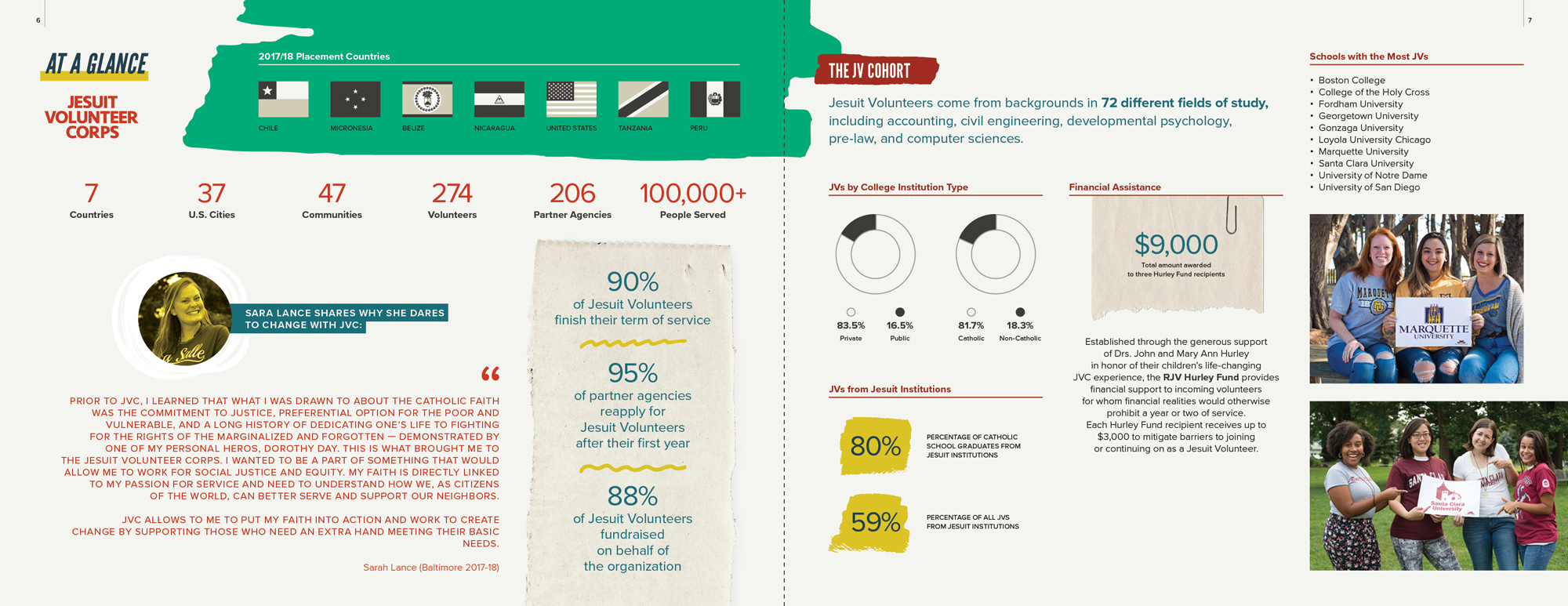
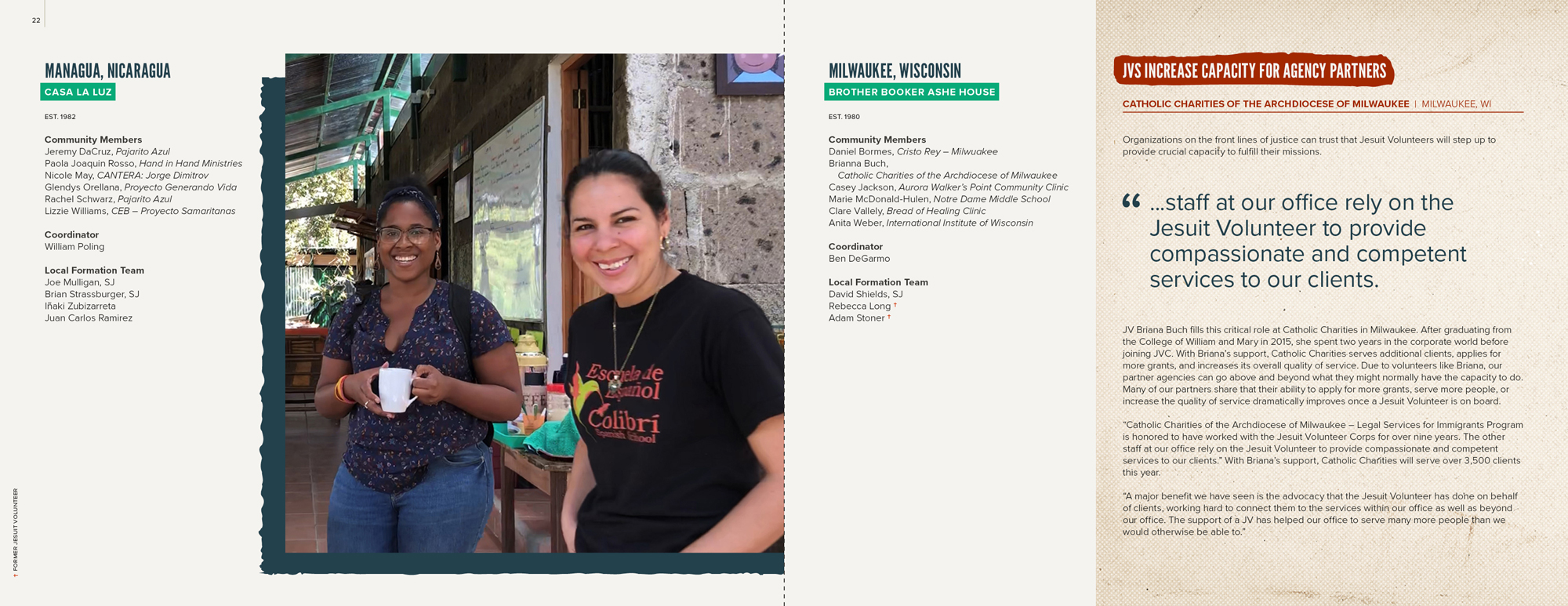
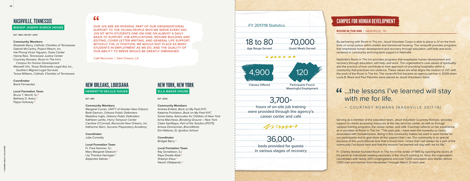
The Jesuit Volunteer Corps dramatically increased the content shared within their annual report this year, amounting to 88 pages when all was said and done. Rather than professionally printing the report, the organization elected for us to e-publish it, saving both dollars and trees. Just a few of the spreads from our finished work are posted below.
getting social
I manage KURR Med Spa’s website and Facebook page, performing ongoing weekly tasks such as developing content to share across multiple platforms and uploading new e-commerce products. Launching later this week will be a series of teasers for a new service coming to the spa in May. Seen below are an initial banner I created for the site’s landing page, and a coordinating social media graphic to generate excitement among followers.
linnea's lights
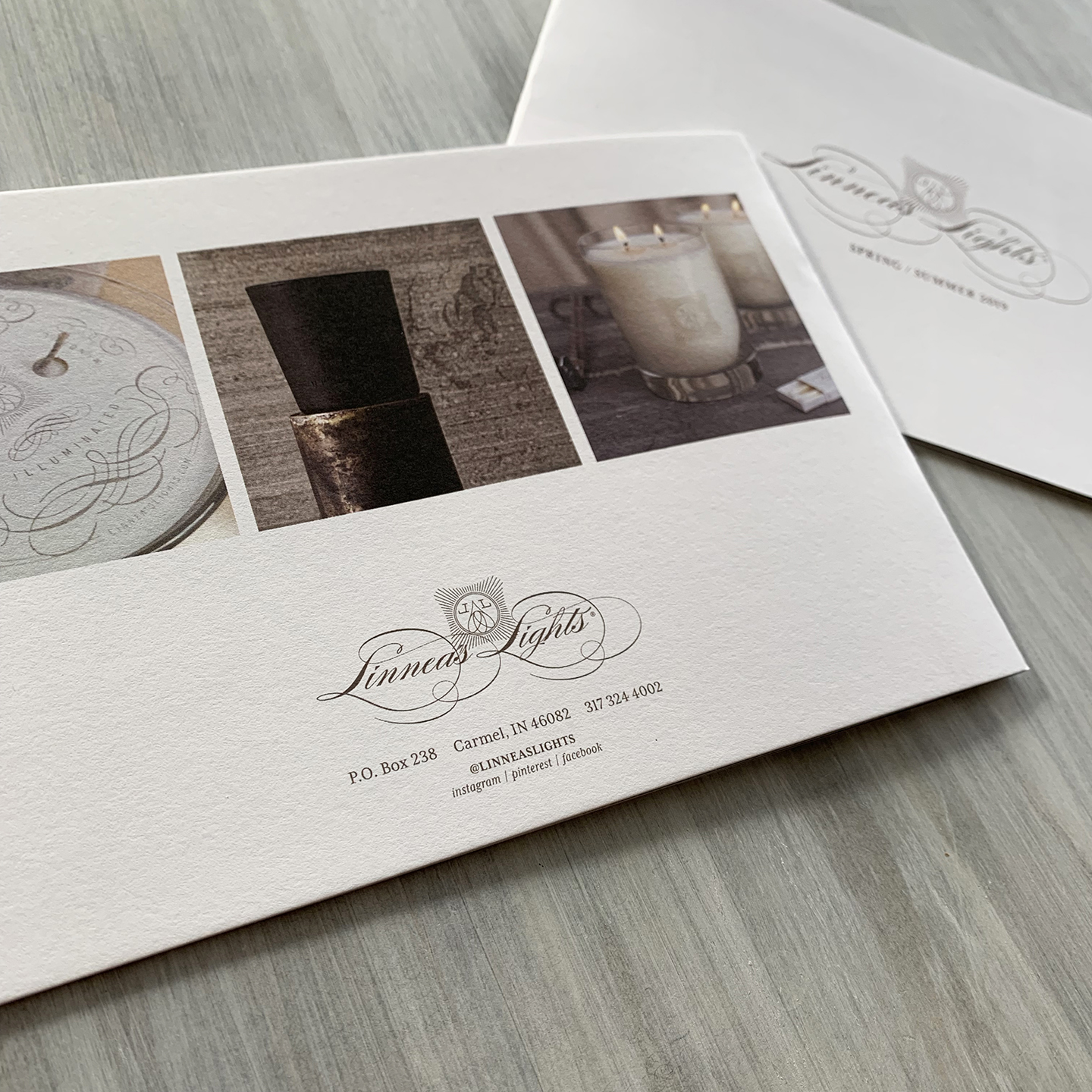
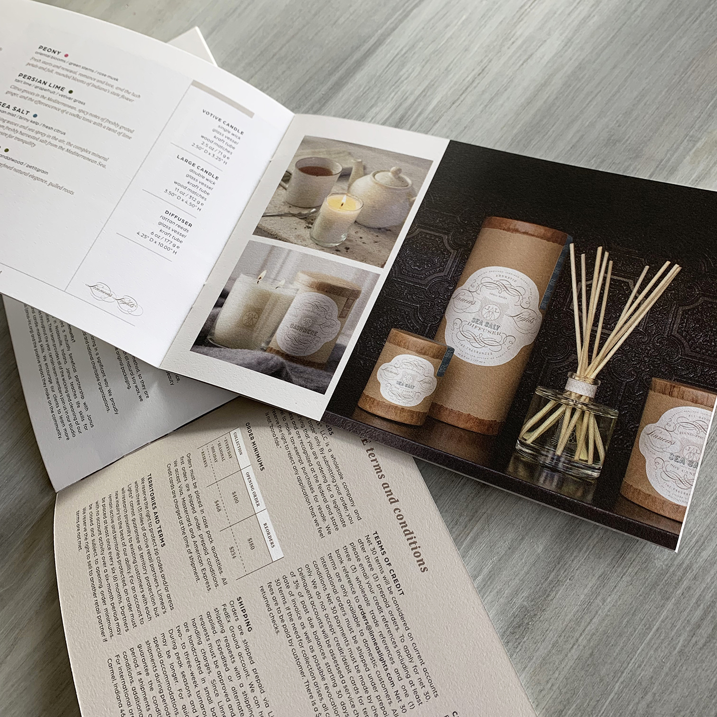
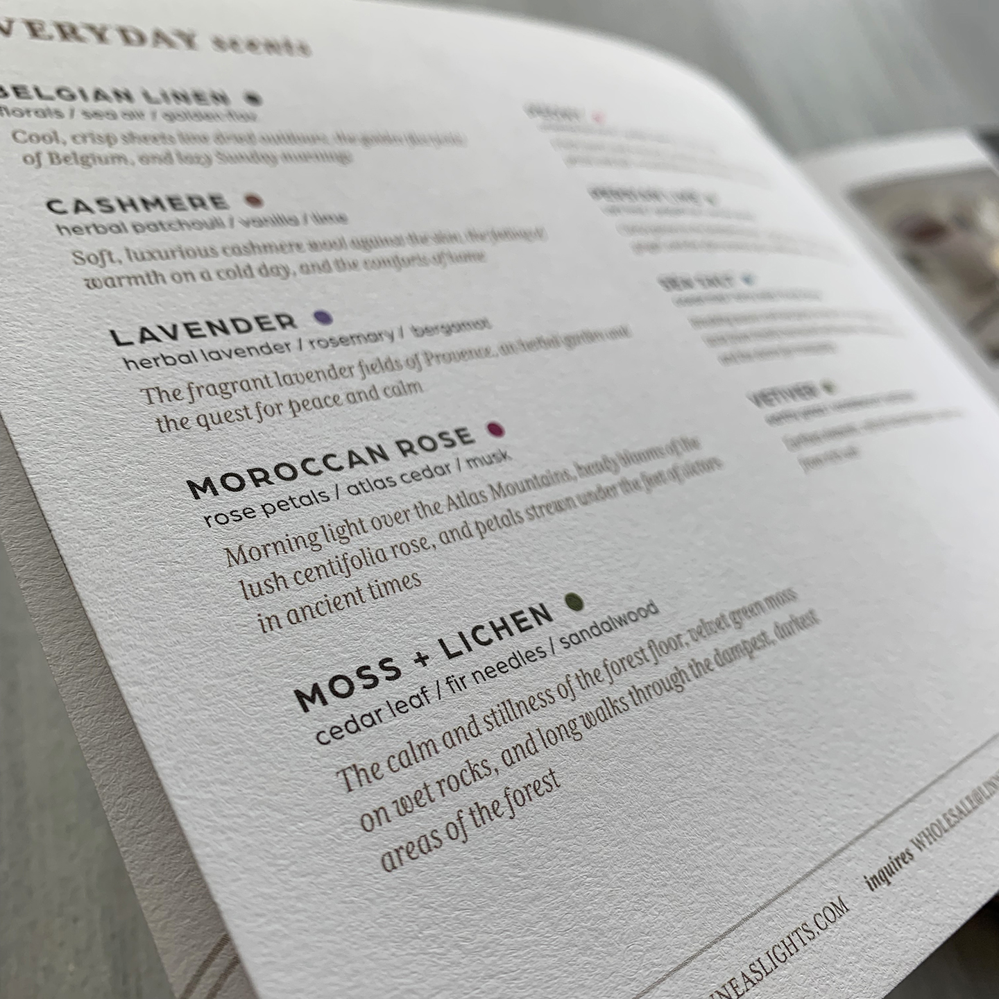
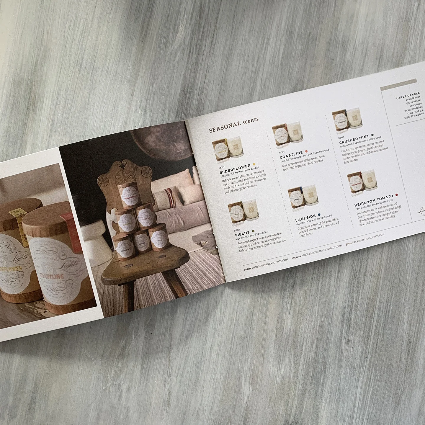
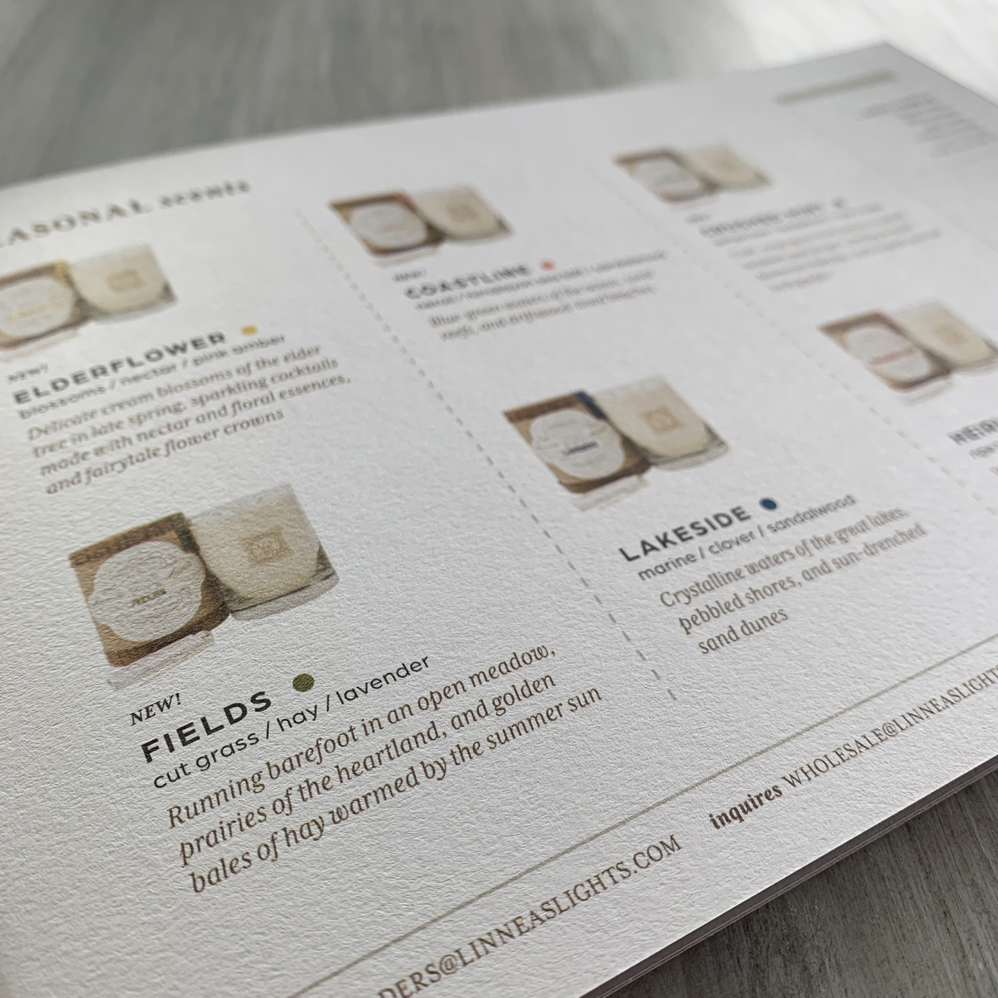
I began working with Linnea’s Lights, an American-made luxury brand of home fragrances, earlier this year. The first assignment was to develop new label and package design concepts for the company’s primary collection, which is scheduled to launch on retail shelves late 2019. But, as a business model always one season ahead for the buying market, I was also tasked with refreshing the wholesale lookbook, showcasing the upcoming spring/summer lines.
a growing magazine
This year’s JVC Magazine, the Jesuit Volunteer Corps’ annual publication, grew to 48 pages, up 20 pages from last year’s edition. Such an honor to partner with an organization that enlists courageous young leaders who selflessly aim to promote change and seek equality for the underprivileged, and inject much-needed compassion in our world.
all aboard
As a designer, versatility is key. I got a quick schooling from a client in Alabama when I mistakingly referred to his vision as “Star Wars.” After all, Star Trek was his vision, and they are very different. So, once that lesson was out of the way, we went to work on developing a logo for his new family-owned, group transportation company named Starship Coach. We started with the logo and then moved onto graphics (the wrap) for all four sides of the gigantic bus, and then stationery and a retractable banner. Passengers will soon be on the road in this stylish motorcoach.
new and random
. . .and this is only the short list: website, social media graphic, product packaging and building signage.

